이전 내용
[FastAPI] FastAPI + Streamlit + PostgresSQL (2)
이전 내용 [FastAPI] FastAPI + Streamlit + PostgresSQL (1)이전 내용 [SQL] PostgreSQL: pg Admin 사용하기이전 내용 [SQL] PostgresSQL 다운로드 하기PostgresSQL 란? PostgreSQL은 오픈 소스 객체-관계형 데이터베이스 관리 시
puppy-foot-it.tistory.com
대략적인 진행 순서
- PostgreSQL (pg Admin)을 통해 데이터베이스, 테이블 생성
- FastAPI (VS Code)를 통해
- 가상 환경 만들기 (가상 환경명: my_shop)
- 가상 환경에 필요한 라이브러리 설치하기
- PostgreSQL 연결하기
- 가상 데이터(Faker 라이브러리) 생성
- 생성된 데이터 데이터베이스에 삽입하기 ▶ 1편
- 고객 더미 데이터, 마케팅 더미 데이터 수정 및 추가
- 데이터 분석 함수 만들기 ▶ 2편
- FastAPI로 API 기능 구현하기
- 포스트맨으로 테스트 하기
- Streamlit (VS Code) 을 통해
- Streamlit과 FastAPI 연동하기
- Streamlit 데이터분석 시각화 함수 구현하기
- Streamlit 실행하여 확인하기
FastAPI로 API 기능 구현하기
이제 main.py 라는 파일을 생성하여 fastapi를 import 하고 각 데이터(고객, 판매, 마케팅)를 띄울 수 있게 해보는 작업을 수행한다.
◆ FastAPI 프레임워크를 사용하여 웹 애플리케이션 설정
from fastapi import FastAPI, HTTPException
from fastapi.responses import JSONResponse
from analysis import get_customer_analysis, get_sales_analysis, get_marketing_analysis

# FastAPI 앱 생성
app = FastAPI()- FastAPI: FastAPI 프레임워크의 주요 클래스. 웹 애플리케이션을 만들기 위해 사용되며, RESTful API를 쉽게 구축할 수 있다.
- HTTPException: HTTP 오류를 발생시키는 예외 클래스로, 클라이언트 요청에 대해 적절한 오류 응답을 반환할 수 있다.
- JSONResponse: JSON 형식으로 응답을 반환하기 위해 사용하는 클래스.
- 사용자 분석, 판매 분석 및 마케팅 분석을 수행하는 함수들 임포트
- app이라는 변수가 FastAPI의 인스턴스 생성. 이 객체를 사용하여 API 엔드포인트를 정의하고 요청을 처리할 수 있다.
◆ FastAPI 프레임워크를 사용하여 고객 분석 결과를 받아오는 API 엔드포인트 정의
# 고객 정보 불러오기
@app.post("/analysis/customer")
def analysis_customer():
    try:
        analysis_result = get_customer_analysis()
        return JSONResponse(content=analysis_result)
    except Exception as e:
        print(f"Error: {str(e)}")
raise HTTPException(status_code=500, detail=f"An error occured: {str(e)}")- @app.post(...): FastAPI의 데코레이터로, HTTP POST 요청을 처리하는 엔드포인트를 정의. "/analysis/customer" URL 경로로 POST 요청을 수신한다.
- analysis_customer(): POST 요청이 도착했을 때 실행되는 함수. 고객 분석을 수행하고 결과를 반환한다.
- get_customer_analysis() 함수를 호출하여 고객 분석 결과를 가져온다. 이 함수는 고객 관련 데이터를 분석하고 결과를 반환하는 기능을 수행한다.
- JSON 응답: 분석 결과를 JSONResponse 형식으로 클라이언트에게 반환한다. 이는 통신 규약에 따른 표준 JSON 형식이다.
- try-except 블록을 사용하여 함수 실행 중 발생할 수 있는 예외 처리. 오류 발생 시, 오류 메시지를 콘솔에 출력하고, HTTPException을 사용하여 500 상태 코드와 함께 클라이언트에게 오류 세부 정보를 반환한다.
◆ FastAPI 프레임워크를 사용하여 판매 분석 결과를 받아오는 API 엔드포인트 정의
# 판매 정보 불러오기
@app.post("/analysis/sales")
def analysis_sale():
    try:
        anal_sale_result = get_sales_analysis()
        return JSONResponse(content=anal_sale_result)
    except Exception as e:
        print(f"Error: {str(e)}")
        raise HTTPException(status_code=500, detail=f"An error orruced: {str(e)}")
◆ FastAPI 프레임워크를 사용하여 마케팅 분석 결과를 받아오는 API 엔드포인트 정의
# 마케팅 정보 불러오기
@app.post("/analysis/marketing")
def analysis_marketing():
    try:
        anal_marketing_result = get_marketing_analysis()
        return JSONResponse(content=anal_marketing_result)
    except Exception as e:
        print(f"Error: {str(e)}")
        raise HTTPException(status_code=500, detail=f"An error orruced: {str(e)}")
포스트맨으로 테스트
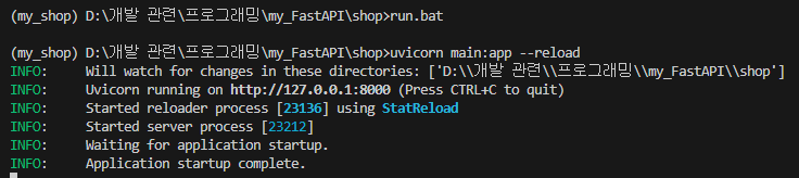
main.py 파일(서버)을 실행 시키기 위한 run.bat 라는 파일을 만들고, 해당 파일 내에 main 서버를 실행시키는 FastAPI 명령어를 입력해 준다.
uvicorn main:app --reload
그리고 터미널에서 run.bat를 실행해주면 서버가 켜진다.
이제 포스트맨을 실행하고, 각 엔드포인트를 POST 메소드와 함께 실행해서 JSON 형식으로 데이터를 반환하는지 체크해본다.
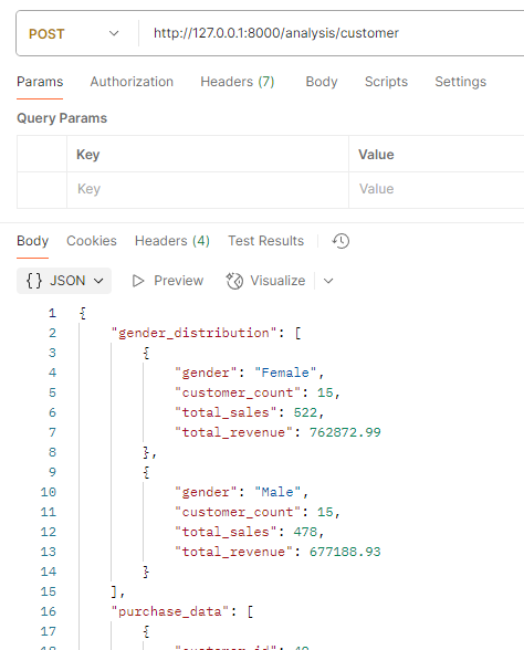
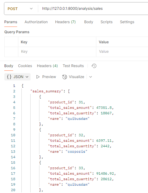
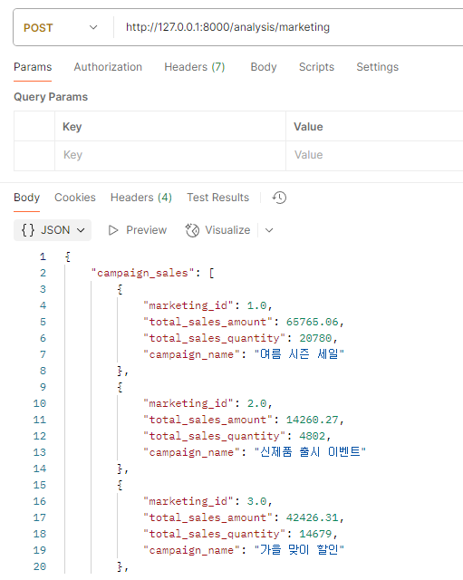
모든 엔드포인트가 잘 실행되는 것을 확인할 수 있다.
Streamlit 으로 시각화하기
(데이터 시각화, 웹 시각화)
데이터가 잘 연결되는 것을 확인했으니, Streamlit 으로 view를 만들어주는 동시에, 데이터들을 차트로 시각화 해주는 작업을 진행해 준다. 이를 위해 app.py 라는 이름의 파이썬 파일을 생성한다.
[초기 설정]
- 필요한 라이브러리 import
- 한글 및 마이너스 깨짐 설정
- 각 데이터 불러오기
import streamlit as st
import pandas as pd
import numpy as np
import matplotlib.pyplot as plt
import requests
import plotly.express as px
import plotly.graph_objs as go

# 메인 페이지 너비 넓게
# st.set_page_config(layout='wide')

# 한글 및 마이너스 깨짐 설정
from matplotlib import rc
plt.rcParams['font.family'] = "Malgun Gothic"
plt.rcParams['axes.unicode_minus'] = False

local_url = "http://127.0.0.1:8000/"
anal_url = local_url + "analysis/"

# 데이터 가져오기
try:
    # 고객 데이터
    customer_data = requests.post(anal_url + "customer")
    customer_data = customer_data.json()
    # 판매 데이터
    sales_data = requests.post(anal_url + "sales")
    sales_data = sales_data.json()
    # 마케팅 데이터
    marketing_data = requests.post(anal_url + "marketing")
    marketing_data = marketing_data.json()
except requests.exceptions.RequestException as e:
    st.error(f"API 요청 실패: {e}")
customer_data = {}- requests.post(url): requests 라이브러리를 사용하여 HTTP POST 요청을 보내는 함수. 이 함수는 URL에 데이터를 전송할 때 주로 사용되며, 서버에 리소스를 생성하거나 업데이트할 목적으로 사용된다.
[탭 생성 및 고객 분석 탭 시각화 설정]
# 탭 생성
tab1, tab2, tab3 = st.tabs(['고객데이터', '판매데이터', '마케팅데이터'])
# 색상 팔레트
palette = px.colors.qualitative.Set2
# 고객 분석 탭
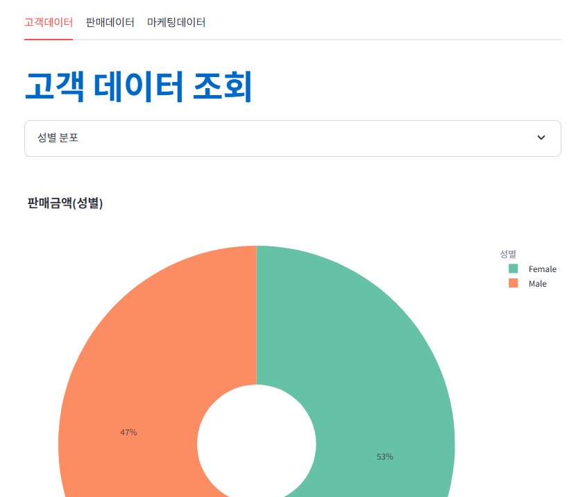
with tab1:
st.markdown("# **:blue[고객 데이터 조회]**")
# 성별 분포
with st.expander("성별 분포"):
st.dataframe(customer_data['gender_distribution'])
fig = px.pie(
customer_data['gender_distribution'],
names='gender',
values='total_revenue',
title='판매금액(성별)',
hole=0.3,
color='gender',
color_discrete_sequence=palette,
hover_data='total_revenue'
)
fig.update_layout(legend_title_text='성별', width=900, height=700)
st.plotly_chart(fig, use_container_width=True)
with st.expander("구매 데이터"):
st.dataframe(customer_data['purchase_data'])
with st.expander("구매 통계"):
st.dataframe(customer_data['purchase_statistics'])
with st.expander("31일동안 비구매 고객"):
st.dataframe(customer_data['inactive_customers'])
with st.expander("상위 5위 고객(구매금액 기준)"):
st.dataframe(customer_data['top5_customers'])
[판매 분석 탭 시각화 설정]
# 판매 분석 탭
with tab2:
    st.markdown("# **:blue[판매 데이터 조회]**")
    with st.expander("판매 데이터 요약"):
        st.dataframe(sales_data['sales_summary'])
    fig = px.bar(
        data_frame=sales_data['sales_summary'],
        x='name',
        y='total_sales_amount',
        orientation='v',
        title='제품별 판매 금액',
        color='name',
        template='plotly_white'
    )
    fig.update_layout(plot_bgcolor='rgba(0,0,0,0)', xaxis=dict(showgrid=False))
    st.plotly_chart(fig, use_container_width=True)


    with st.expander("판매 상위 5개 제품"):
        st.dataframe(sales_data['top5_products'])
    fig = px.bar(
        data_frame=sales_data['top5_products'],
        x='total_sales_amount',
        y='name',
        orientation='h',
        title='상위 5개 제품 판매 금액',
        color='name',
        template='plotly_white'
    )
    fig.update_layout(plot_bgcolor='rgba(0,0,0,0)', xaxis=dict(showgrid=False))
    st.plotly_chart(fig, use_container_width=True)


    with st.expander("판매 하위 5개 제품"):
        st.dataframe(sales_data['bottom5_products'])
    fig = px.bar(
        data_frame=sales_data['bottom5_products'],
        x='total_sales_amount',
        y='name',
        orientation='h',
        title='하위 5개 제품 판매 금액',
        color='name',
        template='plotly_white'
    )
    fig.update_layout(plot_bgcolor='rgba(0,0,0,0)', xaxis=dict(showgrid=False))
    st.plotly_chart(fig, use_container_width=True)


    with st.expander("월별 판매 집계"):
        st.dataframe(sales_data['monthly_sales'])
    fig = px.line(
        data_frame=sales_data['monthly_sales'],
        x='month',
        y='total_monthly_sales_amount',
        orientation='v',
        title='월별 판매금액',
        template='plotly_white'
    )
    fig.update_layout(plot_bgcolor='rgba(0,0,0,0)', xaxis=dict(showgrid=False))
    st.plotly_chart(fig, use_container_width=True)


    with st.expander("향후 1년간 월별 판매 예측"):
        st.dataframe(sales_data['predict_sales'])
    fig = px.line(
        data_frame=sales_data['predict_sales'],
        x='month',
        y='predicted_sales',
        orientation='v',
        title='향후 1년간 월별 판매금액',
        template='plotly_white'
    )
    fig.update_layout(plot_bgcolor='rgba(0,0,0,0)', xaxis=dict(showgrid=False))
    st.plotly_chart(fig, use_container_width=True)
[마케팅 분석 탭 시각화 설정]
# 마케팅 분석 탭
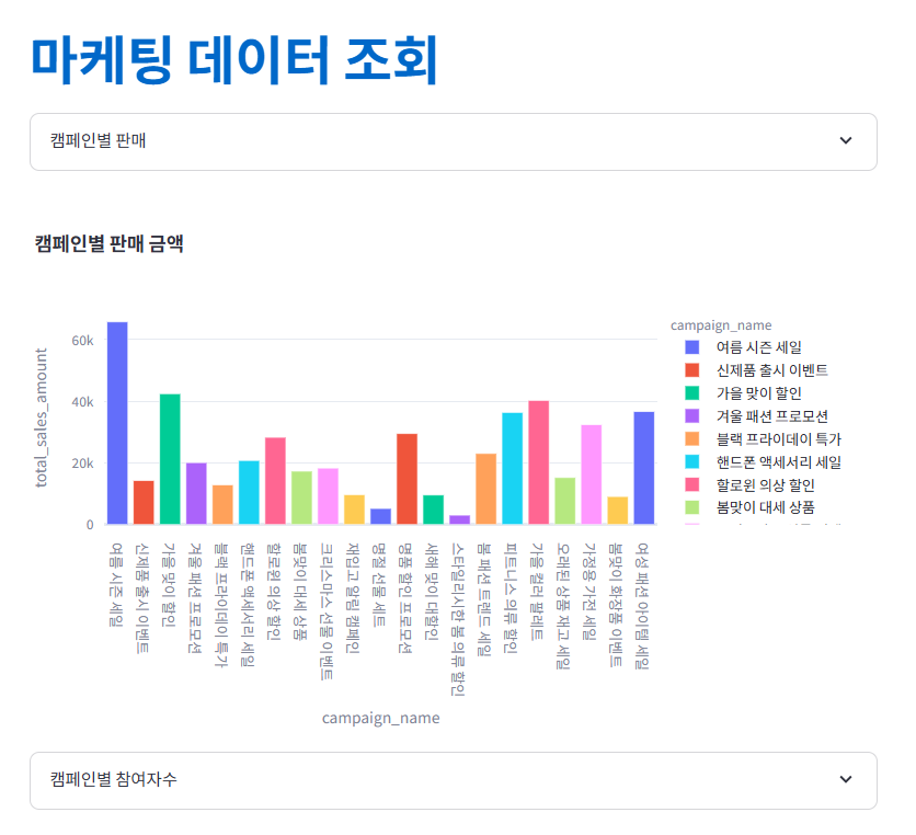
with tab3:
st.markdown("# **:blue[마케팅 데이터 조회]**")
with st.expander("캠페인별 판매"):
st.dataframe(marketing_data['campaign_sales'])
fig = px.bar(
data_frame=marketing_data['campaign_sales'],
x='campaign_name',
y='total_sales_amount',
orientation='v',
title='캠페인별 판매 금액',
color='campaign_name',
template='plotly_white'
)
fig.update_layout(plot_bgcolor='rgba(0,0,0,0)', xaxis=dict(showgrid=False))
st.plotly_chart(fig, use_container_width=True)
with st.expander("캠페인별 참여자수"):
st.dataframe(marketing_data['campaign_participants'])
fig = px.pie(
marketing_data['campaign_participants'],
names='campaign_name',
values='participant_count',
title='캠페인별 참여자수',
hole=0.3,
color='campaign_name',
color_discrete_sequence=palette,
hover_data='participant_count'
)
fig.update_layout(legend_title_text='캠페인', width=900, height=700)
st.plotly_chart(fig, use_container_width=True)
with st.expander("ROI 분석"):
st.dataframe(marketing_data['roi_analysis'])
with st.expander("제품 & 캠페인별 판매"):
st.dataframe(marketing_data['product_campaign_sales'])
with st.expander("세그먼트별 판매 금액 (연령대)"):
st.dataframe(marketing_data['segment_sales'])
이제 터미널에서 Streamlit 파일을 실행하여 확인해 본다.
streamlit run app.py
모든 데이터 및 표, 차트가 잘 나온다.
[최종 파일 리스트]
다음 내용
'[파이썬 Projects] > <파이썬 웹개발>' 카테고리의 다른 글
| [파이썬] FastAPI - 쿼리 매개변수, 경로 매개변수, 백그라운드 태스크 (0) | 2025.04.27 |
|---|---|
| [파이썬] FastAPI - 정적 파일, API Router (0) | 2025.04.27 |
| [FastAPI] FastAPI + Streamlit + PostgresSQL (2) (1) | 2025.04.26 |
| [FastAPI] FastAPI + Streamlit + PostgresSQL (1) (1) | 2025.04.25 |
| [파이썬] 프로젝트 : 웹 페이지 구축 - 10(Cloud에 배포하기) (0) | 2025.03.24 |


