이전 내용
[파이썬] 프로젝트 : 웹 페이지 구축 - 11(ML 모델 구현)
이전 내용 [파이썬] 프로젝트 : 대시보드 웹 페이지 구축하기 - 10이전 내용 [파이썬] 프로젝트 : 대시보드 웹 페이지 구축하기 - 9이전 내용 [파이썬] 프로젝트 : 대시보드 웹 페이지 구축하기 - 8
puppy-foot-it.tistory.com
예측 모델 ML 보완
회원 중 이벤트에 참여한 1000명의 회원을 무작위로 뽑아 예측 모델을 만드는 작업을 진행 중이다.
기존에 만들어놨던 모델 및 코드를 보완하여 더 많은 정보가 출력되도록 수정한다.
보완하는 김에 다른 파일들도 더 보완한다. (계속 보완할 게 보이니 '프로젝트_최최최최최최종' 의 느낌이다.)
가입 여부 예측 모델
기존에 예측 후 가입 여부와 해당 모델의 정확도만 뜨던 결과를 다른 성능 평가 지표(재현율, 정밀도, f1-score 등)가 같이 뜨도록 하였고, Confusion Matrix와 ROC-AUC 차트도 같이 뜨도록 보완해줬다.
▶ 시각화 때 차트가 너무 크게 나오기 때문에 서브플롯을 이용하여 차트가 한 눈에 담기도록 하였다.
전날 빅데이터분석기사 공부를 하다가 정확도가 높은 모델이 무조건 좋은 것은 아니라고 하였고, 이럴 때 다른 성능 평가 지표를 같이 활용하여 해당 모델의 성능을 평가하는 것이 맞다는 내용을 봤기 때문이다.
with tab1: # 서비스 가입 예측 모델
    col1, col2, col3 = st.columns([4, 3, 3])
    with col1:
        st.write("서비스가입 예측 모델입니다. 아래의 조건을 선택해 주세요.")
        ages_1 = st.slider(
            "연령대를 선택해 주세요.",
            25, 65, (35, 45)
        )
        st.write(f"**선택 연령대: :red[{ages_1}]세**")

    with col2:
        gender_1 = st.radio(
            "성별을 선택해 주세요.",
            ["남자", "여자"],
            index=1
        )

    with col3:
        marriage_1 = st.radio(
            "혼인여부를 선택해 주세요.",
            ["미혼", "기혼"],
            index=1
        )

    # 예측 모델 학습 및 평가 함수
    @st.cache_data
    def train_model(data):
        numeric_features = ['age']
        categorical_features = ['gender', 'marriage']

        # ColumnTransformer 설정
        preprocessor = ColumnTransformer(
            transformers=[
                ('num', StandardScaler(), numeric_features), # 수치형 - 표준화
                ('cat', OneHotEncoder(categories='auto'), categorical_features) # 범주형 - 원핫인코딩
            ]
        )

        # 랜덤 포레스트 모델
        model = Pipeline(steps=[
            ('preprocessor', preprocessor),
            ('classifier', RandomForestClassifier(random_state=42, n_jobs=-1))
        ])

        # 데이터 분할
        X = data.drop(columns=['after_ev'])
        y = data['after_ev']
        X_train, X_test, y_train, y_test = train_test_split(X, y, test_size=0.2, random_state=42)

        # 하이퍼파라미터 튜닝을 위한 그리드 서치
        param_grid = {
            'classifier__n_estimators': [100, 200],
            'classifier__max_depth': [None, 10, 20],
            'classifier__min_samples_split': [2, 5]
        }

        grid_search = GridSearchCV(estimator=model, param_grid=param_grid, cv=3, n_jobs=-1, verbose=2)
        grid_search.fit(X_train, y_train)

        return grid_search, X_test, y_test

    # 성능 평가 및 지표 출력 함수
    def evaluate_model(grid_search, X_test, y_test):
        y_pred = grid_search.predict(X_test)

        # 성능 평가
        accuracy = accuracy_score(y_test, y_pred)
        precision = precision_score(y_test, y_pred)
        recall = recall_score(y_test, y_pred)
        f1 = f1_score(y_test, y_pred)

        # 성능 지표 출력
        st.write(f"이 모델의 정확도: {accuracy * 100:.1f}%, 정밀도(Precision): {precision * 100:.1f}%, 재현율 (Recall): {recall * 100:.1f}%")
        st.write(f"F1-Score: {f1 * 100:.1f}%")

        return y_pred

 	# 시각화 함수 (혼동 행렬 및 ROC 곡선)
    def plot_metrics(y_test, y_pred, grid_search):
        cm = confusion_matrix(y_test, y_pred)

        y_scores = grid_search.predict_proba(X_test)[:, 1]  # 긍정 클래스 확률
        fpr, tpr, thresholds = roc_curve(y_test, y_scores)
        roc_auc = auc(fpr, tpr)

        # 서브플롯 설정
        fig, axs = plt.subplots(1, 2, figsize=(15, 6))

        # 혼동 행렬 시각화
        # https://www.practicalpythonfordatascience.com/ap_seaborn_palette
        sns.heatmap(cm, annot=True, fmt='d', cmap='GnBu',
                    ax=axs[0], xticklabels=['가입', '미가입'], yticklabels=['가입', '미가입'])
        axs[0].set_ylabel('실제 레이블')
        axs[0].set_xlabel('예측 레이블')
        axs[0].set_title('혼동 행렬')

        # ROC 곡선 시각화
        axs[1].plot(fpr, tpr, label='ROC curve (area = {:.2f})'.format(roc_auc))
        axs[1].plot([0, 1], [0, 1], 'k--')  # 랜덤 분류기
        axs[1].set_xlabel('False Positive Rate')
        axs[1].set_ylabel('True Positive Rate')
        axs[1].set_title('Receiver Operating Characteristic (ROC)')
        axs[1].legend(loc='lower right')

        # Streamlit에서 그래프 표시
        st.pyplot(fig)

    # 예측 결과 출력 함수
    def pre_result(model, new_data):
        prediction = model.predict(new_data)
        st.write(f"**모델 예측 결과: :rainbow[{'가입' if prediction[0] == 0 else '미가입'}]**") # 0:가입, 1:미가입
▶ 혼동 행렬 색상 부분은 추가로 수정해 줬다.
추천 캠페인 모델
추천 캠페인 모델의 경우, 조건값을 입력 받으면 기존의 데이터를 가지고 머신러닝 모델을 통해 가장 적합한 캠페인을 추천해 주는 모델을 계획했었는데, 어떤 조건값이던 가장 첫번째(0) 캠페인을 추천해 주는 에러가 있었다.
그리하여 조건을 입력 받으면 각 조건의 캠페인별 캠페인 참여 전과 후의 가입 증가율을 계산하여 가장 높은 증가율을 보이는 캠페인을 추천하는 방식으로 변경하였다.
또한, 캠페인 증가율을 수치로 나타내고, 막대 그래프로 시각화하는 것을 추가하였다.
+ 필터링 조건에 도시를 추가하였다.
data_2 = memeber_df[['age', 'city', 'gender', 'marriage', 'before_ev', 'part_ev', 'after_ev']]

# 참여 이벤트 매핑
event_mapping = {
    0: "워크숍 개최",
    1: "재활용 품목 수집 이벤트",
    2: "재활용 아트 전시",
    3: "게임 및 퀴즈",
    4: "커뮤니티 청소 활동",
    5: "업사이클링 마켓",
    6: "홍보 부스 운영"
}

city_mapping = {
    0:'부산',
    1:'대구',
    2:'인천',
    3:'대전',
    4:'울산',
    5:'광주',
    6:'서울',
    7:'경기',
    8:'강원',
    9:'충북',
    10:'충남',
    11:'전북',
    12:'전남',
    13:'경북',
    14:'경남',
    15:'세종',
    16:'제주'
}

city_options = ["전체지역"] + list(city_mapping.values())

with tab2: # 캠페인 추천 모델
    col1, col2, col3, col4 = st.columns([4, 2, 2, 2])
    with col1:
        st.write("캠페인 추천 모델입니다. 아래의 조건을 선택해 주세요.")
        ages_2 = st.slider(
            "연령대를 선택해 주세요.",
            25, 65, (35, 45),
            key='slider_2'
        )
        st.write(f"**선택 연령대: :red[{ages_2}]세**")

    with col2:
        city_2 = st.selectbox(
            "도시를 선택해 주세요.",
            city_options,
            index=0,
            key='selectbox2'
        )
        city_index = city_options.index(city_2)  # 선택된 도시의 인덱스 저장

    with col3:
        gender_2 = st.radio(
            "성별을 선택해 주세요.",
            ["남자", "여자"],
            index=1,
            key='radio2_1'
        )

    with col4:
        marriage_2 = st.radio(
            "혼인여부를 선택해 주세요.",
            ["미혼", "기혼"],
            index=1,
            key='radio2_2'
        )

    # 추천 모델 함수
    @st.cache_data
    def calculate_enrollment_increase_rate(data):
        #캠페인 별 가입 증가율 계산
        increase_rates = {}

        # 조건별 캠페인 그룹화 및 계산
        campaign_groups = data.groupby('part_ev')

        for campaign, group in campaign_groups:
            # 캠페인전과 후의 가입자 수 계산
            pre_signups = (group['before_ev'] == 0).sum()  # 캠페인 전 가입자 수 (0의 수)
            post_signups = (group['after_ev'] == 0).sum()  # 캠페인 후 가입자 수 (0의 수)

            # 가입 증가율 계산 (0으로 나누는 경우 처리)
            if pre_signups > 0:
                increase_rate = (post_signups - pre_signups) / pre_signups
            else:
                increase_rate = 1 if post_signups > 0 else 0  # 가입자 수가 없다면 증가율 1

            increase_rates[campaign] = increase_rate

        return increase_rates

    def recommend_campaign(data, age_range, city_index, gender, marriage):
    # 조건에 따라 데이터 필터링
        if city_index == 0: # '전체 지역' 선택
            filtered_data = data[
                (data['age'].between(age_range[0], age_range[1])) &
                (data['gender'] == (1 if gender == '여자' else 0)) &
                (data['marriage'] == (1 if marriage == '기혼' else 0))
            ]
        else: # 특정 도시 선택
            city_name = list(city_mapping.values())[city_index]  # 선택된 도시의 이름을 가져옴
            filtered_data = data[
                (data['age'].between(age_range[0], age_range[1])) &
                (data['city'] == city_name) &
                (data['gender'] == (1 if gender == '여자' else 0)) &
                (data['marriage'] == (1 if marriage == '기혼' else 0))
            ]

        if filtered_data.empty:
            return "해당 조건에 맞는 데이터가 없습니다."

        # 가입 증가율 계산
        increase_rates = calculate_enrollment_increase_rate(filtered_data)

        # 가장 높은 가입 증가율을 가진 캠페인 추천
        best_campaign = max(increase_rates, key=increase_rates.get)

        return best_campaign, increase_rates

    # 사용자 정보 입력을 통한 추천 이벤트 평가
    if st.button("캠페인 추천 받기"):
        best_campaign, increase_rates = recommend_campaign(data_2, ages_2, city_index, gender_2, marriage_2)

        if isinstance(best_campaign, str):
            st.write(best_campaign)
        else:
            st.write(f"**추천 캠페인: :violet[{event_mapping[best_campaign]}] 👈 이 캠페인이 가장 가입을 유도할 수 있습니다!**")

            # 가입 증가율 결과 출력
            with st.expander("**각 캠페인별 가입 증가율 보기**"):
                for campaign, rate in increase_rates.items():
                    st.write(f"캠페인 {event_mapping[campaign]}의 가입 증가율: {rate:.2%}")

            # 가입 증가율 결과 출력 및 가로 막대그래프 표시
            campaigns, rates = zip(*increase_rates.items())
            campaigns = [event_mapping[campaign] for campaign in campaigns]  # 매핑된 캠페인 이름

            # 파스텔 톤 색상 리스트 생성
            pastel_colors = plt.cm.Pastel1(np.linspace(0, 1, len(campaigns)))

            # 가로 막대그래프
            fig, ax = plt.subplots()
            ax.barh(campaigns, rates, color=pastel_colors)
            ax.axvline(0, color='gray', linewidth=0.8)  # 중간 0 선

            ax.set_xlabel('가입 증가율')
            ax.set_title('캠페인 별 가입 증가율')
            ax.set_xlim(min(min(rates), 0), max(max(rates), 0))  # X축 범위 설정

            st.pyplot(fig)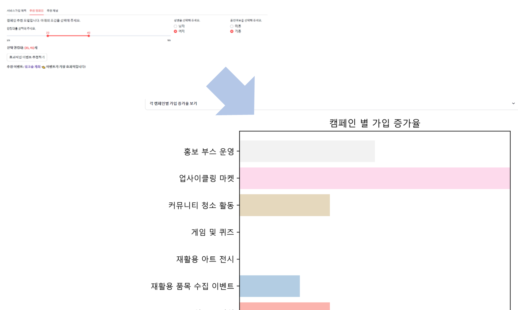
▶ 조금 아쉬운 건 평점 데이터를 추가해서 평점을 기반으로 캠페인을 추천해주는 추천 시스템으로 구현하는 게 더 낫지 않았을까 하는 마음이다.
[머신러닝] 추천시스템
머신러닝 기반 분석 모형 선정 [머신러닝] 머신러닝 기반 분석 모형 선정머신러닝 기반 분석 모형 선정 지도 학습, 비지도 학습, 강화 학습, 준지도 학습, 전이 학습 1) 지도 학습: 정답인 레
puppy-foot-it.tistory.com
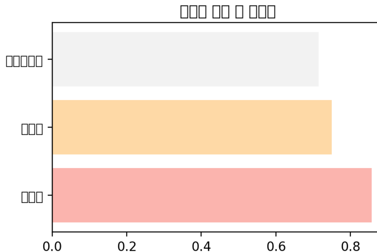
온라인 마케팅 채널 추천 모델
위의 캠페인 추천 모델과 마찬가지로, 온라인 마케팅 채널 역시 특정 캠페인 (3개를 추천해달라고 했기 때문에 0, 1, 2)만 결과로 표시되는 오류가 있었다.
마찬가지로, 해당 모델 역시 각 채널별 가입 증가율을 더하여 입력 조건에 맞는 마케팅 채널을 추천하는 방식으로 변경한다.
대신에, 캠페인 추천 모델과는 달리 캠페인 참여 여부는 회원 가입 여부와는 상관 관계가 덜하므로, 캠페인 후의 서비스 가입 여부를 나타내는 'after_ev' 칼럼은 제외하도록 한다.
또한, 온라인 마케팅 특성 상 도시 같은 지리적 변수는 중요치 않으므로 'city' 역시 빼도록 한다.
이전과 마찬가지로 유입경로 중의 직접 유입은 제외하도록 한다. (키워드 검색은 포함)
data_3 = memeber_df[['age', 'gender', 'marriage', 'channel', 'before_ev']]

# 가입 시 유입경로 매핑
register_channel = {
    0:"직접 유입",
    1:"키워드 검색",
    2:"블로그",
    3:"카페",
    4:"이메일",
    5:"카카오톡",
    6:"메타",
    7:"인스타그램",
    8:"유튜브",
    9:"배너 광고",
    10:"트위터 X",
    11:"기타 SNS"
}

with tab3: # 마케팅 채널 추천 모델
    col1, col2, col3 = st.columns([6, 2, 2])
    with col1:
        st.write("마케팅 채널 추천 모델입니다. 아래의 조건을 선택해 주세요")
        ages_3 = st.slider(
            "연령대를 선택해 주세요.",
            25, 65, (35, 45),
            key='slider_3'
        )
        st.write(f"**선택 연령대: :red[{ages_3}]세**")

    with col2:
        gender_3 = st.radio(
            "성별을 선택해 주세요.",
            ["남자", "여자"],
            index=0,
            key='radio3_1'
        )

    with col3:
        marriage_3 = st.radio(
            "혼인여부를 선택해 주세요.",
            ["미혼", "기혼"],
            index=0,
            key='radio3_2'
        )

    # 추천 모델 함수
    @st.cache_data
    def calculate_channel_conversion_rate(data):
        # 마케팅 채널별 가입률 계산
        channel_stats = data.groupby('channel').agg(
        total_members=('before_ev', 'count'),   # 전체 유입자 수
        total_signups=('before_ev', lambda x: (x == 0).sum())  # 가입자 수 (before_ev가 0인 경우)
        )

        # 가입률 계산: 가입자의 수 / 전체 유입자의 수
        channel_stats['conversion_rate'] = channel_stats['total_signups'] / channel_stats['total_members']
        channel_stats.reset_index(inplace=True)
        return channel_stats[['channel', 'conversion_rate']]

    def recommend_channel(data, age_range, gender, marriage):
        #조건에 맞는 가장 추천 마케팅 채널 3개를 반환
        filtered_data = data[
            (data['age'].between(age_range[0], age_range[1])) &
            (data['gender'] == (1 if gender == '여자' else 0)) &
            (data['marriage'] == (1 if marriage == '기혼' else 0))
        ]

        channel_rates = calculate_channel_conversion_rate(filtered_data)

        # "직접 유입" 채널 제외
        channel_rates = channel_rates[channel_rates['channel'] != 0]

        top_channels = channel_rates.nlargest(3, 'conversion_rate')

        return top_channels

    def display_channel_rates(channel_rates):
        #마케팅 채널 가입률 수치 표시
        with st.expander("**각 마케팅 채널별 가입률 보기**"):
            for _, row in channel_rates.iterrows():
                channel_name = register_channel[row['channel']]
                st.write(f"{channel_name}: {row['conversion_rate']:.2%}")

    def plot_channel_rates(channel_rates):
        #마케팅 채널 가입률 시각화 (막대 그래프)
        fig, ax = plt.subplots(figsize=(5, 3))

        # 파스텔 톤 색상 리스트 생성
        pastel_colors = plt.cm.Pastel1(np.linspace(0, 1, len(channel_rates)))

        ax.barh(channel_rates['channel'].apply(lambda x: register_channel[x]),
                channel_rates['conversion_rate'], color=pastel_colors)

        ax.axvline(0, color='gray', linewidth=0.8)  # 중간 0 선
        ax.set_xlabel('가입률')
        ax.set_title('마케팅 채널 별 가입률')
        ax.set_xlim(0, channel_rates['conversion_rate'].max() * 1.1)  # X축 범위 설정

        st.pyplot(fig)

    # 사용자 정보 입력을 통한 추천 이벤트 평가
    if st.button("효과적인 마케팅 채널 추천받기"):
        # 추천 모델 훈련
        top_channels = recommend_channel(data_3, ages_3, gender_3, marriage_3)

        if not top_channels.empty:
            st.write(f"**추천 마케팅 채널:** :violet[{', '.join(top_channels['channel'].apply(lambda x: register_channel[x]))}] 👈 이 채널들이 가장 효과적입니다!")
            display_channel_rates(top_channels)
            plot_channel_rates(top_channels)
        else:
            st.write("해당 조건에 맞는 마케팅 채널이 없습니다.")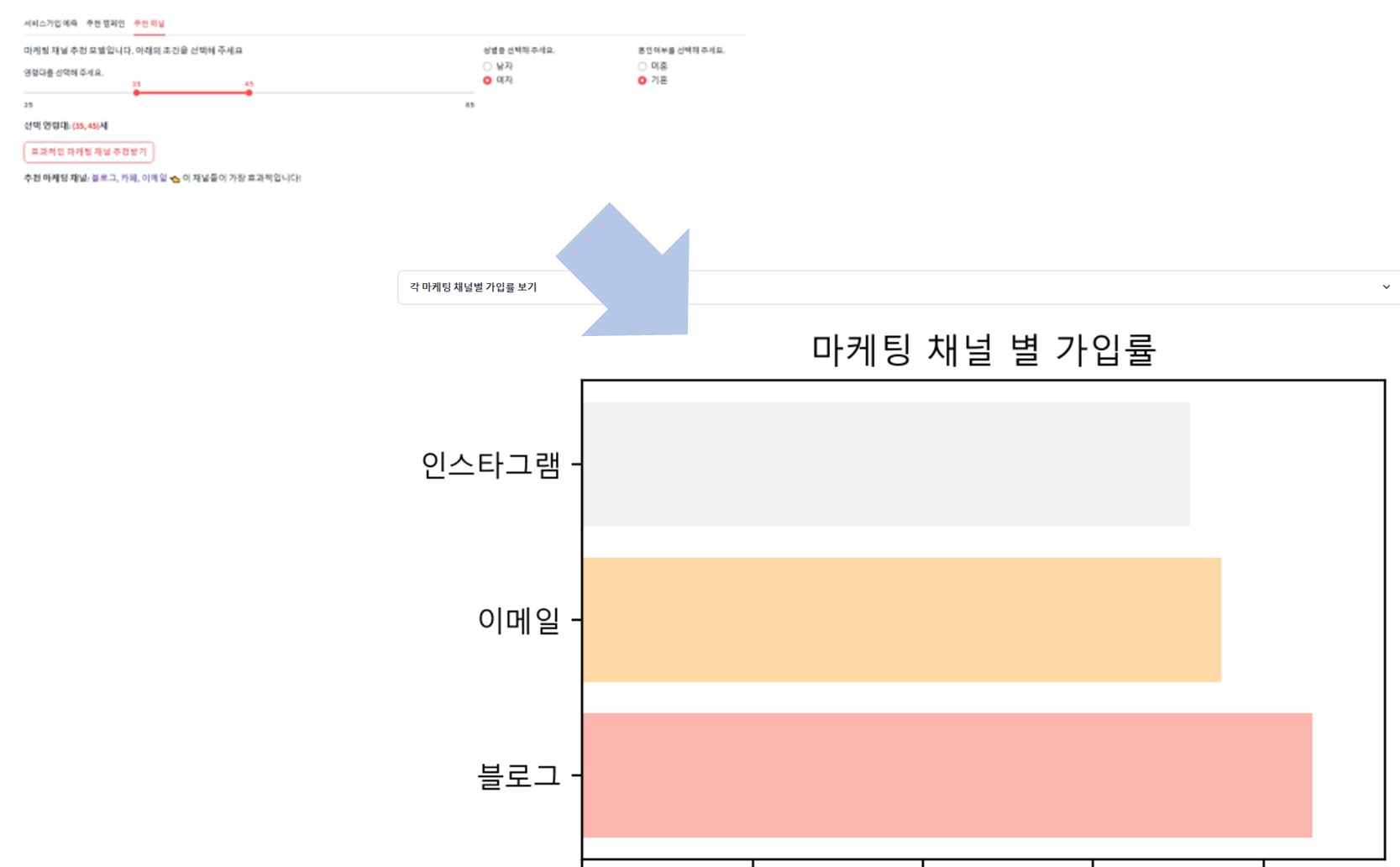
모델 추가하기
1. 전환율 예측 모델
우리 조원분이 두 가지 모델을 만들어서 줬기 때문에, 해당 모델을 기존 코드에 또 추가해야 한다.
두 가지 모델은
- 전환율 예측 모델: 디바이스, 유입경로, 체류시간을 토대로 전환율 예측(랜덤포레스트) ▶ 온라인 데이터셋 기반
- 방문자수 예측 모델: 날짜, 지역, 방문자수를 기준으로 향후 12개월 간의 방문자수 예측 모델 (랜덤포레스트 회귀) ▶ 오프라인 데이터셋 기반
이다. (나보다 낫다)
어쨌든 이 코드들을 예측 모델.py에 넣는 작업을 해본다.
먼저 기존 3개의 탭을 5개로 늘려야하고, 탭4에 전환율 예측 모델, 탭5에 방문자수 예측 모델 코드를 넣어주면 될듯하다.
tab1, tab2, tab3, tab4, tab5 = st.tabs(['서비스가입 예측', '추천 캠페인', '추천 채널', '전환율 예측', '방문자수 예측'])
그리고 해당 모델 작동 시에는 온라인 데이터셋과 오프라인 데이터셋이 필요하므로, 해당 데이터셋을 불러오는 코드도 넣어줘야 한다. (깃허브에 올려둔 csv 파일 로드. CSV_FILE_PATH 변수를 미리 줬기 때문에 뒤에 파일명만 바꿔줌.)
해당 데이터프레임은 expander 안에 넣어서 숨겨놓고 필요할 때만 출력되도록 한다.
#온/오프라인 데이터 로드
@st.cache_data
def on_load_data():
    df_on = pd.read_csv(CSV_FILE_PATH + 'recycling_online.csv', encoding="UTF8").fillna(0)
    df_on.replace([np.inf, -np.inf], np.nan, inplace=True)
    df_on.fillna(0, inplace=True)
    return df_on

@st.cache_data
def off_load_data():
    df_off = pd.read_csv(CSV_FILE_PATH + 'recycling_off.csv', encoding="UTF8")
    df_off.replace([np.inf, -np.inf], np.nan, inplace=True)
    df_off.dropna(subset=["날짜"], inplace=True)
    return df_off

df_on = on_load_data()
df_off = off_load_data()

#데이터 출력
with st.expander('온라인 데이터'):
    st.dataframe(df_on, use_container_width=True)
with st.expander('오프라인 데이터'):
    st.dataframe(df_off, use_container_width=True)
[탭4. 전환율 예측 모델 구현 코드]
with tab4:  #전환율 예측
    select_all_device = st.checkbox("디바이스 전체 선택")
    device_options = df_on["디바이스"].unique().tolist()
    select_all_path = st.checkbox("유입경로 전체 선택")
    path_options = df_on["유입경로"].unique().tolist()

    if select_all_device:
        select_device = st.multiselect("디바이스", device_options, default = device_options)
    else:
        select_device = st.multiselect("디바이스", device_options)

    if select_all_path:
        select_path = st.multiselect("유입경로", path_options, default = path_options)
    else:
        select_path = st.multiselect("유입경로", path_options)
    time_input = st.slider("체류 시간(분)", min_value = 0, max_value = 100, value = 0, step = 5)

    #온라인 데이터 복사 및 원-핫 인코딩
    df_ml_on = df_on.copy()
    df_ml_on = pd.get_dummies(df_ml_on, columns = ["디바이스", "유입경로"])

    #체류시간 및 원-핫 인코딩된 디바이스, 유입경로 및 타겟 변수 설정
    features = ["체류시간(min)"] + [col for col in df_ml_on.columns if "디바이스_" in col or "유입경로_" in col]
    target = "전환율(가입)"

    if st.button("온라인 전환율 예측"):
        #입력(X), 출력(y) 데이터 정의
        X = df_ml_on[features]
        y = df_ml_on[target]

        #학습 데이터와 테스트 데이터 분할(학습 데이터 : 80%, 테스트 데이터 : 20%)
        X_train, X_test, y_train, y_test = train_test_split(X, y, test_size = 0.2, random_state = 42)

        #결측값 처리
        y_train.fillna(y_train.median(), inplace = True)

        #랜덤 포레스트 회귀 모델 생성 및 학습
        on_model = RandomForestRegressor(n_estimators = 100, random_state = 42, n_jobs=-1)
        on_model.fit(X_train, y_train)

        #테스트 데이터 예측
        y_pred = on_model.predict(X_test)

        #✅예측 결과 시각화(실제 전환율 VS 예측 전환율 비교)
        fig_ml_on, ax_ml_on = plt.subplots(figsize = (9, 6))
        sns.lineplot(
            x = y_test,         #실제 값
            y = y_pred,         #예측 값
            marker = "o",
            ax = ax_ml_on,
            linestyle = "-",
            label="예측 vs 실제"
        )
        ax_ml_on.grid(visible = True, linestyle = "-", linewidth = 0.5)
        ax_ml_on.set_title("전환율 예측 결과 비교")
        ax_ml_on.set_xlabel("실제 전환율")
        ax_ml_on.set_ylabel("예측 전환율")
        ax_ml_on.legend()
        st.pyplot(fig_ml_on)

        #✅사용자가 입력한 값을 기반으로 전환율 예측
        input_data = pd.DataFrame(np.zeros((1, len(features))), columns = features)
        input_data["체류시간(min)"] = time_input    #선택된 체류 시간 입력

        #선택된 디바이스 및 유입 경로에 대한 원-핫 인코딩 적용
        for device in select_device:
            if f"디바이스_{device}" in input_data.columns:
                input_data[f"디바이스_{device}"] = 1

        for path in select_path:
            if f"유입경로_{path}" in input_data.columns:
                input_data[f"유입경로_{path}"] = 1

        #전환율 예측 결과 출력
        predicted_conversion = on_model.predict(input_data)[0]
        st.subheader(f"예상 전환율 : {predicted_conversion:.2f}%")
모델 추가하기
2. 방문자수 예측 모델
방문자수 예측 모델은 tab5 부분만 추가해 주면 된다.
[탭5. 방문자수 예측 모델 구현 코드]
with tab5: #방문자 수 예측
#학습 데이터 준비
df_ml_off = df_off.groupby(["날짜", "지역"])["방문자수"].sum().reset_index()
df_ml_off["날짜"] = pd.to_datetime(df_ml_off["날짜"])
df_ml_off["year"] = df_ml_off["날짜"].dt.year
df_ml_off["month"] = df_ml_off["날짜"].dt.month
df_ml_off["day"] = df_ml_off["날짜"].dt.day
df_ml_off["day_of_week"] = df_ml_off["날짜"].dt.weekday
select_region = st.selectbox("지역을 선택하세요.", df_ml_off["지역"].unique())
df_region = df_ml_off[df_ml_off["지역"] == select_region]
features = ["year", "month", "day", "day_of_week"]
X = df_region[features]
y = df_region["방문자수"]
if st.button("오프라인 방문자 수 예측"): #향후 12개월간의 방문자 수 예측
X_train, X_test, y_train, y_test = train_test_split(X, y, test_size = 0.2, random_state = 42)
off_model = RandomForestRegressor(n_estimators = 100, random_state = 42, n_jobs = -1)
off_model.fit(X_train, y_train)
future_dates = pd.date_range(start = df_region["날짜"].max(), periods = 12, freq = "ME")
future_df = pd.DataFrame({"year" : future_dates.year, "month": future_dates.month, "day": future_dates.day, "day_of_week": future_dates.weekday})
future_pred = off_model.predict(future_df)
future_df["예측 방문자 수"] = future_pred
future_df["날짜"] = future_dates
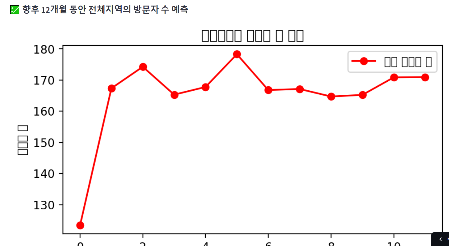
st.subheader(f":chart: {select_region}의 방문자 수 예측")
fig_ml_off, ax_ml_off = plt.subplots(figsize = (9, 6))
ax_ml_off.plot(future_df.index, future_df["예측 방문자 수"], marker = "o", linestyle = "-", color = "red", label = "예측 방문자 수")
ax_ml_off.set_title(f"{select_region}의 방문자 수 예측")
ax_ml_off.set_xlabel("날짜")
ax_ml_off.set_ylabel("방문자 수")
ax_ml_off.legend()
st.pyplot(fig_ml_off)
future_df["날짜"] = pd.to_datetime(future_df["날짜"]).apply(lambda x: x.replace(day = 1))
future_df["날짜"] = future_df["날짜"] + pd.DateOffset(months = 1)
future_df["예측 방문자 수"] = future_df["예측 방문자 수"].astype(int).astype(str) + "명"
st.subheader(":chart: 향후 12개월의 방문자 수 예측")
st.write(future_df[["날짜", "예측 방문자 수"]])코드 수정하기
◆ 예측 모델 파일
[방문자수 예측]
1. 방문자수 데이터에 전체 지역 옵션을 추가하고, 전체지역이 선택됐을 때 모든 지역을 합친 예측값이 표시되도록 수정하였다.
2. 오프라인 데이터프레임이 방문자수 예측 탭 내에 표시되도록 수정하였다.
3. 기타 수정 (레이아웃, 시각화 옵션 등)
with tab5:  #방문자 수 예측
    #데이터 출력
    with st.expander('오프라인 데이터'):
        st.dataframe(df_off, use_container_width=True)

    city_options = ["전체지역"] + list(city_mapping.values())

    #학습 데이터 준비
    df_ml_off = df_off.groupby(["날짜", "지역"])["방문자수"].sum().reset_index()
    df_ml_off["날짜"] = pd.to_datetime(df_ml_off["날짜"])
    df_ml_off["year"] = df_ml_off["날짜"].dt.year
    df_ml_off["month"] = df_ml_off["날짜"].dt.month
    df_ml_off["day"] = df_ml_off["날짜"].dt.day
    df_ml_off["day_of_week"] = df_ml_off["날짜"].dt.weekday

    select_region = st.selectbox("지역을 선택하세요.", city_options)

    if select_region == "전체지역":
        df_region = df_ml_off  # 전체 지역 데이터를 사용
    else:
        df_region = df_ml_off[df_ml_off["지역"] == select_region]  # 특정 지역 데이터 사용

    features = ["year", "month", "day", "day_of_week"]
    X = df_region[features]
    y = df_region["방문자수"]

    if st.button("오프라인 방문자 수 예측"):    #향후 12개월간의 방문자 수 예측
        X_train, X_test, y_train, y_test = train_test_split(X, y, test_size = 0.2, random_state = 42)
        off_model = RandomForestRegressor(n_estimators = 100, random_state = 42, n_jobs = -1)
        off_model.fit(X_train, y_train)

        future_dates = pd.date_range(start = df_region["날짜"].max(), periods = 12, freq = "ME")
        future_df = pd.DataFrame({"year" : future_dates.year, "month": future_dates.month, "day": future_dates.day, "day_of_week": future_dates.weekday})
        future_pred = off_model.predict(future_df)
        future_df["예측 방문자 수"] = future_pred
        future_df["날짜"] = future_dates

        st.subheader(f":chart: 향후 12개월 동안 {select_region}의 방문자 수 예측")
        fig_ml_off, ax_ml_off = plt.subplots(figsize = (6, 3))
        ax_ml_off.plot(future_df.index, future_df["예측 방문자 수"], marker = "o", linestyle = "-", color = "red", label = "예측 방문자 수")
        ax_ml_off.set_title(f"{select_region}의 방문자 수 예측")
        ax_ml_off.set_xlabel("날짜")
        ax_ml_off.set_ylabel("방문자 수")
        ax_ml_off.legend()
        st.pyplot(fig_ml_off)

        future_df["날짜"] = pd.to_datetime(future_df["날짜"]).apply(lambda x: x.replace(day = 1))
        future_df["날짜"] = future_df["날짜"] + pd.DateOffset(months = 1)

        future_df["예측 방문자 수"] = future_df["예측 방문자 수"].astype(int).astype(str) + "명"
        st.write(future_df[["날짜", "예측 방문자 수"]])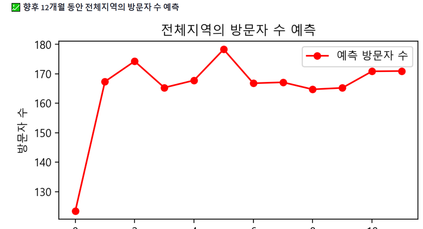
[전환율 예측]
랜덤포레스트 회귀 모델의 예측 시간이 오래 걸려서 하이퍼파라미터를 수정해줬다.
on_model = RandomForestRegressor(n_estimators=50, max_depth=10, random_state = 42, n_jobs=-1)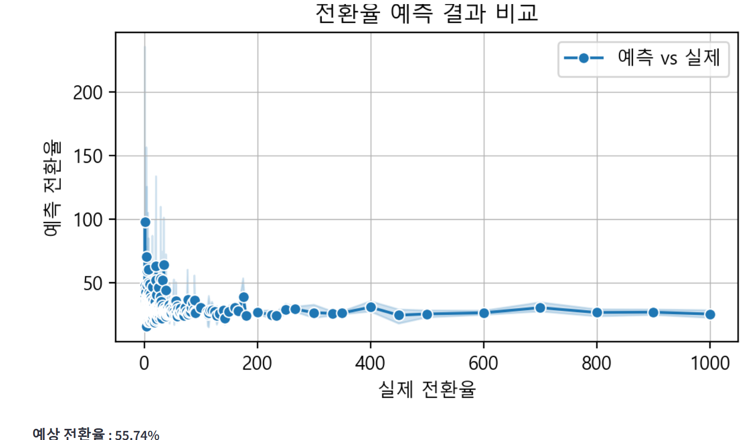
[탭1, 탭2, 탭3]
회원가입 데이터프레임이 탭 내에 표시되도록 위치를 수정해줬다.
◆ Summary 파일
팀원분께서 내가 만든 코드를 심미적으로 보완해 준다고 하셨는데, 기록별 차트가 다 날아가 버리고 해당 프로젝트 내에 기간별 차트가 하나도 남지 않게 되었다. 따라서 Summary 파일 내에 필터링 조건이 없는 전체 기간별 데이터를 넣고, 역시 데이터프레임은 expander로 넣어서 숨기기 기능을 적용하도록 한다.
[오프라인]
1. 지역별 방문자수 데이터 프레임 숨기기 버튼
2. 지역별 참여율 파이 차트
with st.expander("**💻지역별 데이터**"):
    st.dataframe(off_data_by_city, use_container_width=True)  # 오프라인 지역별 데이터

# 지역별 참여율 파이차트
fig = px.pie(
    off_data_by_city,
    names='지역',
    values='참여율',
    title="🎨지역별 참여율 비교",
    hole=0.3,
    color='지역',
    color_discrete_sequence=palette,
    hover_data='참여율',
)
fig.update_layout(legend_title_text='지역', width=900, height=700)
st.plotly_chart(fig, use_container_width=True)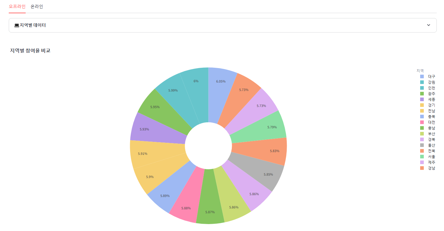
2. 요일별 방문자수, 참여자수 추가된 데이터프레임 생성 및 숨기기 버튼
3. 요일별 방문자수, 참여자수 막대그래프 추가
with st.expander("**💻요일별 데이터**"):
    off_df["날짜"] = pd.to_datetime(off_df["날짜"], errors="coerce")
    off_df['요일'] = off_df['날짜'].dt.day_of_week
    week_mapping = {0: "월", 1: "화", 2: "수", 3: "목", 4: "금", 5: "토", 6: "일"}
    off_df['요일'] = off_df['요일'].map(week_mapping)
    off_df_by_week = (off_df.groupby('요일').agg({"방문자수":"sum","참여자수": "sum"}).reset_index())
    st.dataframe(off_df_by_week, use_container_width=True)

# 시각화
def create_barplot_by_day_off(data, value_col, title):
    fig = px.bar(
        data_frame=data,
        x=value_col,
        y="요일",
        orientation="h",
        title=f"<b>{title}</b>",
        color="요일",
        template="plotly_white"
    )

    # x축 범위 설정
    min_value = data[value_col].min()   # 최소값
    max_value = data[value_col].max()   # 최대값
    fig.update_xaxes(range=[min_value * 0.9, max_value * 1.1])  # 범위 설정

    # 레이아웃 업데이트
    fig.update_layout(
        plot_bgcolor = "rgba(0,0,0,0)",
        xaxis=dict(showgrid=False)
    )

    return fig

# 차트 생성
col1, col2 = st.columns(2)

with col1:
    fig_weekday_visit = create_barplot_by_day_off(off_df_by_week, '방문자수', '요일별 방문자수 막대그래프')
    st.plotly_chart(fig_weekday_visit, use_container_width=True)

with col2:
    fig_weekday_part = create_barplot_by_day_off(off_df_by_week, '참여자수', '요일별 참여자수 막대그래프')
    st.plotly_chart(fig_weekday_part, use_container_width=True)

st.divider()
4. 월별 방문자수, 참여자수 추가된 데이터프레임 생성 및 숨기기 버튼
5. 월별 방문자수, 참여자수 라인그래프 추가 (연도별 비교)
with st.expander("**💻월별 데이터**"):
        # 날짜를 월 단위로 변환하여 연도와 월 정보 생성
        off_df['연도'] = off_df['날짜'].dt.year
        off_df['월'] = off_df['날짜'].dt.month

        # 연도와 월로 그룹화하여 방문자 수와 참여자 수 집계
        off_df_by_month = off_df.groupby(['연도', '월']).agg({"방문자수": "sum", "참여자수": "sum"}).reset_index()

        # 데이터 확인
        st.dataframe(off_df_by_month, use_container_width=True)

    # 라인차트 생성
    def create_monthly_by_year_line_chart(data, value_col, title):
        fig = px.line(
            data_frame=data,
            x="월",
            y=value_col,
            orientation="v",
            title=f"<b>{title}</b>",
            color="연도",
            template="plotly_white"
        )

        # 레이아웃 업데이트
        fig.update_layout(
            plot_bgcolor="rgba(0,0,0,0)",
            xaxis=dict(showgrid=False)
        )
        return fig

    # 차트 생성
    col1, col2 = st.columns(2)

    with col1:
        fig_month_visit = create_monthly_by_year_line_chart(off_df_by_month, '방문자수', '월별 방문자수 연도별 비교')
        st.plotly_chart(fig_month_visit, use_container_width=True)

    with col2:
        fig_month_part = create_monthly_by_year_line_chart(off_df_by_month, '참여자수', '월별 참여자수 연도별 비교')
        st.plotly_chart(fig_month_part, use_container_width=True)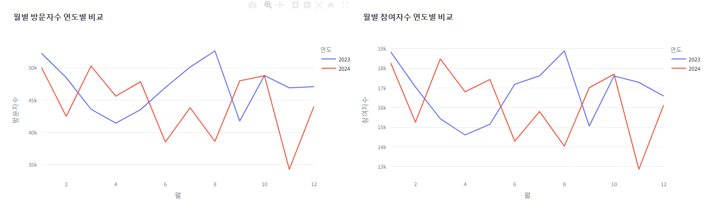
[온라인]
1. 채널별 데이터프레임 숨기기
2. 요일별 유입, 전환 데이터프레임 생성 후 숨기기
3. 요일별 유입수, 전환수 막대그래프 ▶ 전환수는 회원가입, 앱 다운, 구독을 합쳐서 진행
    with st.expander("**💻요일별 데이터**"):
            on_df["날짜"] = pd.to_datetime(on_df["날짜"], errors="coerce")
            on_df['요일'] = on_df['날짜'].dt.day_of_week
            week_mapping = {0: "월", 1: "화", 2: "수", 3: "목", 4: "금", 5: "토", 6: "일"}
            on_df['요일'] = on_df['요일'].map(week_mapping)
            on_df_by_week = (on_df.groupby('요일').agg({"유입수":"sum","회원가입": "sum", "앱 다운": "sum", "구독": "sum"}).reset_index())
            st.dataframe(on_df_by_week, use_container_width=True)

    # 시각화
    def create_barplot_by_day(data, value_col, title):
        fig = px.bar(
            data_frame=data,
            x=value_col,
            y="요일",
            orientation="h",
            title=f"<b>{title}</b>",
            color="요일",
            template="plotly_white"
        )

        # x축 범위 설정
        min_value = data[value_col].min()   # 최소값
        max_value = data[value_col].max()   # 최대값
        fig.update_xaxes(range=[min_value * 0.9, max_value * 1.1])  # 범위 설정

        # 레이아웃 업데이트
        fig.update_layout(
            plot_bgcolor = "rgba(0,0,0,0)",
            xaxis=dict(showgrid=False)
        )

        return fig

    # 차트 생성
    col1, col2 = st.columns(2)

    with col1:
        fig_weekday_in = create_barplot_by_day(on_df_by_week, '유입수', '요일별 유입수 막대그래프')
        st.plotly_chart(fig_weekday_in, use_container_width=True)

    with col2:
        on_df_by_week['전환수'] = on_df_by_week[['회원가입', '앱 다운', '구독']].sum(axis=1)
        fig_weekday_act = create_barplot_by_day(on_df_by_week, '전환수', '요일별 전환수 막대그래프')
        st.plotly_chart(fig_weekday_act, use_container_width=True)

    st.divider()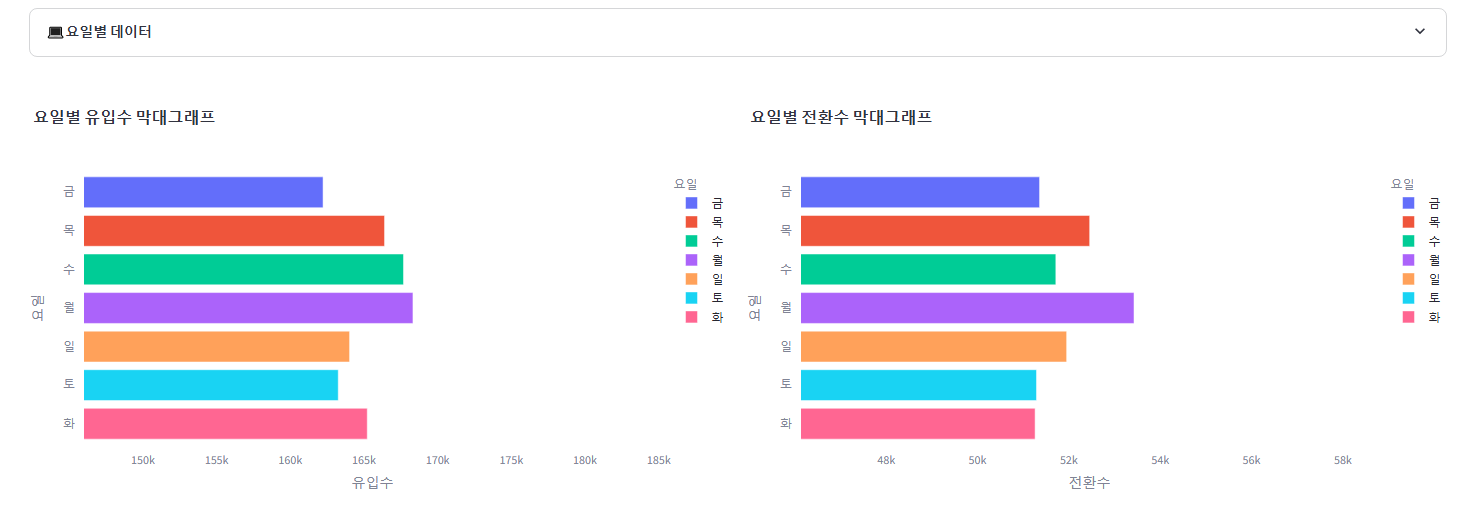
4. 월별 유입수 전환수 라인 차트 ▶ 전환수는 회원가입, 앱 다운, 구독을 합쳐서 진행
    with st.expander("**💻월별 데이터**"):
        # 날짜를 월 단위로 변환하여 연도와 월 정보 생성
        on_df['연도'] = on_df['날짜'].dt.year
        on_df['월'] = on_df['날짜'].dt.month

        # 연도와 월로 그룹화하여 방문자 수와 참여자 수 집계
        on_df_by_month = on_df.groupby(['연도', '월']).agg({"유입수":"sum","회원가입": "sum", "앱 다운": "sum", "구독": "sum"}).reset_index()

        # 데이터 확인
        st.dataframe(on_df_by_month, use_container_width=True)

    # 라인차트 생성
    def create_monthly_by_year_line_chart_on(data, value_col, title):
        fig = px.line(
            data_frame=data,
            x="월",
            y=value_col,
            orientation="v",
            title=f"<b>{title}</b>",
            color="연도",
            template="plotly_white"
        )

        # 레이아웃 업데이트
        fig.update_layout(
            plot_bgcolor="rgba(0,0,0,0)",
            xaxis=dict(showgrid=False)
        )
        return fig

    # 차트 생성
    col1, col2 = st.columns(2)

    with col1:
        fig_month_in = create_monthly_by_year_line_chart_on(on_df_by_month, '유입수', '월별 유입수 연도별 비교')
        st.plotly_chart(fig_month_in, use_container_width=True)

    with col2:
        on_df_by_month['전환수'] = on_df_by_month[['회원가입', '앱 다운', '구독']].sum(axis=1)
        fig_month_act = create_monthly_by_year_line_chart_on(on_df_by_month, '전환수', '월별 전환수 연도별 비교')
        st.plotly_chart(fig_month_act, use_container_width=True)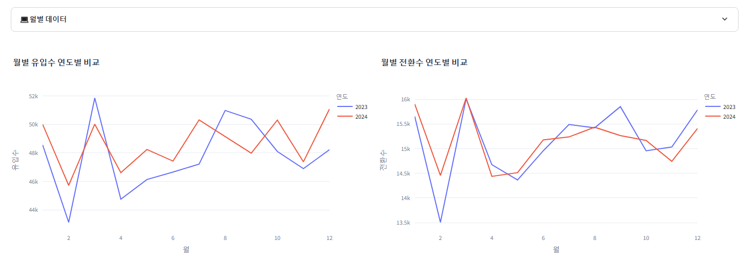
5. 산점도 차트: 기존의 유입수만 표시 → 전환수도 (따로) 표시되도록
    c1, c2 = st.columns(2)
    with c1:
        # 산점도 생성을 위한 Plotly 시각화
        fig = go.Figure()

        # 산점도 추가
        fig.add_trace(
            go.Scatter(
                x=on_by_route_ex["유입수"],
                y=on_by_route_ex["유입경로"],
                mode="markers+text",
                name="유입수 데이터",
                text=on_by_route_ex["유입수"],
                textposition="top center",  # 텍스트 표시 위치
                marker=dict(color=palette, size=10),
            )
        )

        # 레이아웃 설정
        fig.update_layout(
            title="유입경로별 유입수 Scatter Plot",
            xaxis_title="유입수",
            yaxis_title="유입경로",
            boxmode="group",  # 그룹화된 박스 플롯
            height=600,
            showlegend=True,
        )

        # 결과 출력
        st.plotly_chart(fig, use_container_width=True)

    with c2:
        # 전환 수 합산 열 추가
        on_by_route_ex['전환수'] = on_by_route_ex[['회원가입', '앱 다운', '구독']].sum(axis=1)

        # 산점도 생성을 위한 Plotly 시각화
        fig = go.Figure()

        # 산점도 추가
        fig.add_trace(
            go.Scatter(
                x=on_by_route_ex["전환수"],
                y=on_by_route_ex["유입경로"],
                mode="markers+text",
                name="전환수 데이터",
                text=on_by_route_ex["전환수"],
                textposition="top center",  # 텍스트 표시 위치
                marker=dict(color=palette, size=10),
            )
        )

        # 레이아웃 설정
        fig.update_layout(
            title="유입경로별 전환수 Scatter Plot",
            xaxis_title="전환수",
            yaxis_title="유입경로",
            boxmode="group",  # 그룹화된 박스 플롯
            height=600,
            showlegend=True,
        )

        # 결과 출력
        st.plotly_chart(fig, use_container_width=True)

    st.write(":red[※키워드광고 제외]")
    st.divider()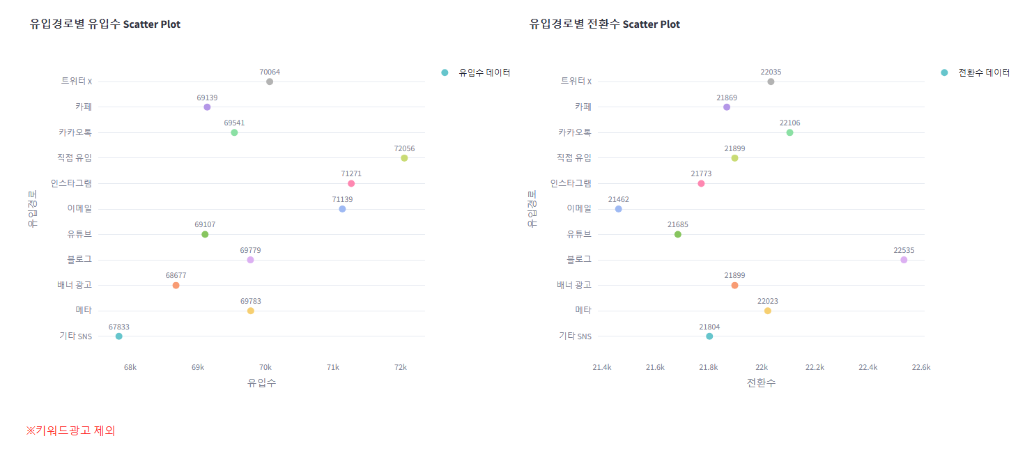
6. 키워드별 전환수: 차이가 더 보일 수 있도록 범위 조정
# 키워드별 전환수
    act_by_keyword = on_df[on_df["유입경로"] == "키워드 검색"]
    act_by_keyword = (
        act_by_keyword.groupby("키워드")
        .agg(
            {
                "노출수": "sum",
                "유입수": "sum",
                "체류시간(min)": "sum",
                "페이지뷰": "sum",
                "이탈수": "sum",
                "회원가입": "sum",
                "앱 다운": "sum",
                "구독": "sum",
                "전환수": "sum",
            }
        )
        .reset_index()
    )
    act_by_keyword = act_by_keyword.dropna(
        subset=[
            "노출수",
            "유입수",
            "체류시간(min)",
            "페이지뷰",
            "이탈수",
            "회원가입",
            "앱 다운",
            "구독",
            "전환수",
        ]
    )  # NaN 제거

    # 수평 막대 차트 생성
    fig = go.Figure()

    for i, row in act_by_keyword.iterrows():
        fig.add_trace(
            go.Bar(
                x=[row["전환수"]],
                y=[row["키워드"]],
                name=row["키워드"],
                orientation="h",
                marker_color=palette[i % len(palette)],
            )
        )

    # x축 범위 설정
    min_value = act_by_keyword["전환수"].min()    # 최소값
    max_value = act_by_keyword["전환수"].max()    # 최대값
    fig.update_xaxes(range=[min_value * 0.9, max_value * 1.1])  # 범위 설정

    fig.update_layout(
        title="광고 키워드별 전환수 그래프",
        barmode="stack",
        height=600,
        template="plotly_white",
    )

    st.plotly_chart(fig, use_container_width=True)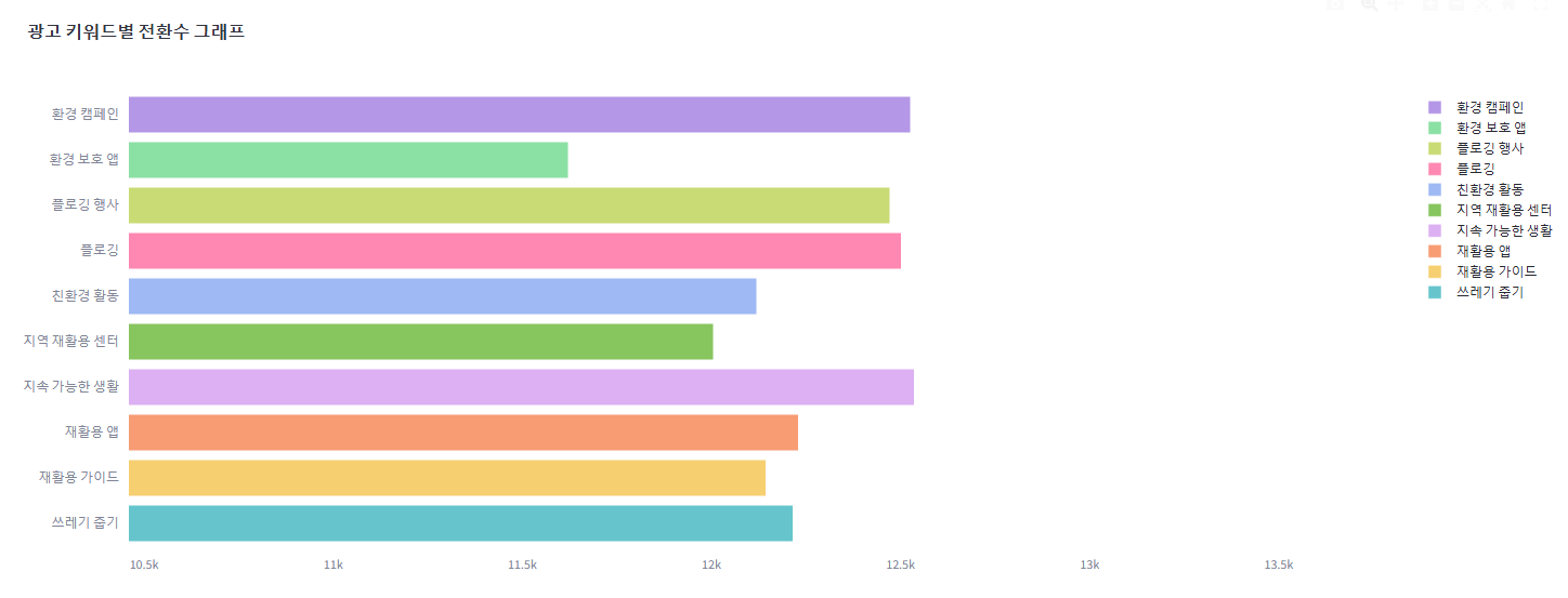
그리고 모델 구현 시 이런저런 시도를 하느라 다양한 라이브러리를 불러왔다가 지우면서 필요없어지게 된 라이브러리들이 있어 import한 라이브러리 중 쓰이지 않는 라이브러리들을 정리해 주는 작업을 한다.
마지막으로, 오프라인 페이지 제목을 일부 수정한 다음 Streamlit Cloud 를 통해 재배포 한다.
▶ 올려놓고 에러를 체크하고 디버깅하는 작업 진행
Streamlit 배포 후 한글, 마이너스 깨짐 현상
문제가 생겼다. 로컬에서 Streamlit 구동 시 문제 없던 한글과 마이너스가 배포 후 인터넷에서 작동 시에는 깨지는 현상이 발견했다.
1. 혼동행렬 시각화
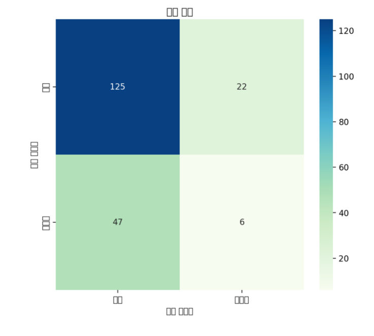
추측하건데, 기존의 코드가 seaborn이나 맷플롯립의 형태로 만들어졌기 때문이 아닐까 싶다. 따라서 이 부분을 plotly 버전으로 변경하면 해결될 듯 하다.
[Seaborn과 Plotly 차이]
Seaborn은 통계적 데이터 시각화에 중점을 두며, 미적이고 간결한 차트를 쉽게 생성할 수 있다.
Plotly는 대화형 시각화를 제공하며, HTML 기반의 대화형 차트를 생성하는 데 적합하다.
바꾸는 김에 ROC Curve 코드도 plotly 버전으로 변경하고 배포한 뒤 실행해보면
# 첫 번째 열에 혼동 행렬 시각화
col1, col2 = st.columns(2)

with col1:
    # 혼동 행렬 시각화
    cm_df = pd.DataFrame(cm, index=['가입', '미가입'], columns=['가입', '미가입'])
    fig = px.imshow(cm_df, text_auto=True, color_continuous_scale='GnBu',
                    title='혼동 행렬')
    fig.update_xaxes(title='예측 레이블')
    fig.update_yaxes(title='실제 레이블')
    fig.update_layout(width=600, height=600)
    st.plotly_chart(fig)

with col2:
    # ROC 곡선 시각화
    fig_roc = go.Figure()

    # ROC 곡선 추가
    fig_roc.add_trace(go.Scatter(x=fpr, y=tpr, mode='lines', name='ROC curve (area = {:.2f})'.format(roc_auc),
                                line=dict(width=2, color='blue')))

    # 랜덤 분류기 추가
    fig_roc.add_trace(go.Scatter(x=[0, 1], y=[0, 1], mode='lines', name='Random Classifier',
                                line=dict(width=2, dash='dash', color='black')))

    # 레이아웃 설정
    fig_roc.update_layout(
        title='Receiver Operating Characteristic (ROC)',
        xaxis_title='False Positive Rate',
        yaxis_title='True Positive Rate',
        showlegend=True,
        width=600,
        height=600
    )

    # Streamlit에서 ROC 곡선 그래프 표시
    st.plotly_chart(fig_roc)
한글이 문제 없이 잘 뜨는 걸 확인할 수 있다.
2, 가로 막대그래프 시각화 (캠페인 추천)
마찬가지로, matplotlib으로 작성된 코드도 plotly로 변경해줘야 한다.
# 가입 증가율 결과 출력
with st.expander("**각 캠페인별 가입 증가율 보기**"):
    for campaign, rate in increase_rates.items():
        st.write(f"캠페인 {event_mapping[campaign]}의 가입 증가율: {rate:.2%}")

# 가입 증가율 결과 출력 및 가로 막대그래프 표시
campaigns, rates = zip(*increase_rates.items())
campaigns = [event_mapping[campaign] for campaign in campaigns]  # 매핑된 캠페인 이름

# 파스텔 톤 색상 리스트 생성
pastel_colors = ['#FF9999', '#66B3FF', '#99FF99', '#FFCC99', '#77DD77', '#B19CD9', '#FFDAB9' ]

# 가로 막대그래프 시각화
fig_bar = go.Figure()

# 가로 막대 추가
fig_bar.add_trace(go.Bar(
    y=campaigns,  # 캠페인 이름
    x=rates,      # 가입 증가율
    orientation='h',  # 가로 막대그래프
    marker=dict(color=pastel_colors),  # 색상 설정
))

# 0 선 추가
fig_bar.add_shape(
    type='line',
    x0=0,
    y0=-0.5,
    x1=0,
    y1=len(campaigns) - 0.5,
    line=dict(color='gray', width=0.8),
)

# 레이아웃 설정
fig_bar.update_layout(
    title='캠페인별 가입 증가율',
    xaxis_title='가입 증가율',
    height=600
)

# X축 설정
fig_bar.update_xaxes(
    range=[min(min(rates), 0), max(max(rates), 0)],  # X축 범위 설정
    showgrid=True
)

# Y축 설정
fig_bar.update_yaxes(
    title='캠페인',
    showgrid=False
)

# Streamlit에서 가로 막대그래프 표시
st.plotly_chart(fig_bar)
▶ 도시 필터링을 적용했을 경우, 전체 지역이 아닌 특정 지역을 선택하면 에러가 발생하여 결국 뺐다.
with tab2: # 캠페인 추천 모델
    with st.expander('회원 데이터'):
        st.dataframe(print_df, use_container_width=True)
    col1, col2, col3 = st.columns([4, 3, 3])
    with col1:
        st.write("캠페인 추천 모델입니다. 아래의 조건을 선택해 주세요.")
        ages_2 = st.slider(
            "연령대를 선택해 주세요.",
            25, 65, (35, 45),
            key='slider_2'
        )
        st.write(f"**선택 연령대: :red[{ages_2}]세**")

    with col2:
        gender_2 = st.radio(
            "성별을 선택해 주세요.",
            ["남자", "여자"],
            index=0,
            key='radio2_1'
        )

    with col3:
        marriage_2 = st.radio(
            "혼인여부를 선택해 주세요.",
            ["미혼", "기혼"],
            index=0,
            key='radio2_2'
        )

    # 추천 모델 함수
    @st.cache_data
    def calculate_enrollment_increase_rate(data):
        #캠페인 별 가입 증가율 계산
        increase_rates = {}

        # 조건별 캠페인 그룹화 및 계산
        campaign_groups = data.groupby('part_ev')

        for campaign, group in campaign_groups:
            # 캠페인전과 후의 가입자 수 계산
            pre_signups = (group['before_ev'] == 0).sum()  # 캠페인 전 가입자 수 (0의 수)
            post_signups = (group['after_ev'] == 0).sum()  # 캠페인 후 가입자 수 (0의 수)

            # 가입 증가율 계산 (0으로 나누는 경우 처리)
            if pre_signups > 0:
                increase_rate = (post_signups - pre_signups) / pre_signups
            else:
                increase_rate = 1 if post_signups > 0 else 0  # 가입자 수가 없다면 증가율 1

            increase_rates[campaign] = increase_rate

        return increase_rates

    def recommend_campaign(data, age_range, gender, marriage):
    # 조건에 따라 데이터 필터링
        filtered_data = data[
            (data['age'].between(age_range[0], age_range[1])) &
            (data['gender'] == (1 if gender == '여자' else 0)) &
            (data['marriage'] == (1 if marriage == '기혼' else 0))
        ]

        if filtered_data.empty:
            return "해당 조건에 맞는 데이터가 없습니다."

        # 가입 증가율 계산
        increase_rates = calculate_enrollment_increase_rate(filtered_data)

        # 가장 높은 가입 증가율을 가진 캠페인 추천
        best_campaign = max(increase_rates, key=increase_rates.get)

        return best_campaign, increase_rates

    # 사용자 정보 입력을 통한 추천 이벤트 평가
    if st.button("캠페인 추천 받기"):
        best_campaign, increase_rates = recommend_campaign(data_2, ages_2, gender_2, marriage_2)

        if isinstance(best_campaign, str):
            st.write(best_campaign)
        else:
            st.write(f"**추천 캠페인: :violet[{event_mapping[best_campaign]}] 👈 이 캠페인이 가장 가입을 유도할 수 있습니다!**")

            # 가입 증가율 결과 출력
            with st.expander("**각 캠페인별 가입 증가율 보기**"):
                for campaign, rate in increase_rates.items():
                    st.write(f"캠페인 {event_mapping[campaign]}의 가입 증가율: {rate:.2%}")

            # 가입 증가율 결과 출력 및 가로 막대그래프 표시
            campaigns, rates = zip(*increase_rates.items())
            campaigns = [event_mapping[campaign] for campaign in campaigns]  # 매핑된 캠페인 이름
3. 가로 막대그래프: 마케팅 채널 추천
def plot_channel_rates(channel_rates):
    #마케팅 채널 가입률 시각화 (막대 그래프)
    fig_bar = go.Figure()

    # 파스텔 톤 색상 리스트 생성
    pastel_colors = ['#FFDAB9', '#BDFCC9', '#E6E6FA']

    fig_bar.add_trace(go.Bar(
        y=channel_rates['channel'].apply(lambda x: register_channel[x]),
        x = channel_rates['conversion_rate'],
        orientation='h',
        marker=dict(color=pastel_colors),
    ))

    # 선추가
    fig_bar.add_shape(
        type='line',
        x0=0,
        y0=-0.5,
        x1=0,
        y1=len(channel_rates) - 0.5,  # Y축 개수
        line=dict(color='gray', width=0.8),
    )

    # 레이아웃 설정
    fig_bar.update_layout(
        title='마케팅 채널별 가입률',
        xaxis_title='가입률',
        height=600
    )

    # X축 설정
    fig_bar.update_xaxes(
        range=[min(min(channel_rates['conversion_rate']), 0), max(max(channel_rates['conversion_rate']), 0)],
        showgrid=True
    )

    # y축 설정
    fig_bar.update_yaxes(
        title='마케팅 채널',
        showgrid=False)

    # 표시
    st.plotly_chart(fig_bar)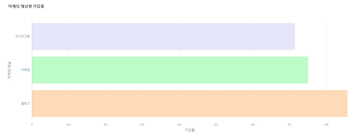
4. 전환율 예측 산점도 그래프
해당 그래프는 출력에 이상은 없지만 plotly 버전으로 변경
#✅예측 결과 시각화(실제 전환율 VS 예측 전환율 비교)
        fig_ml_on = go.Figure()

        # 실제 값과 예측 값 비교를 위한 산점도 추가
        fig_ml_on.add_trace(go.Scatter(
            x=y_test,         # 실제 값
            y=y_pred,         # 예측 값
            mode='markers+lines',  # 마커와 선을 동시에 표시
            marker=dict(symbol='circle', size=8, color='blue', line=dict(width=2)),
            line=dict(shape='linear'),
            name='예측 vs 실제'  # 레전드에 표시될 이름
        ))

        # 레이아웃 설정
        fig_ml_on.update_layout(
            title='✅전환율 예측 결과 비교',
            xaxis_title='실제 전환율',
            yaxis_title='예측 전환율',
            height=600,
            xaxis=dict(showgrid=True),  # X축 그리드 표시
            yaxis=dict(showgrid=True),  # Y축 그리드 표시
        )

        # Streamlit에서 시각화 표시
        st.plotly_chart(fig_ml_on)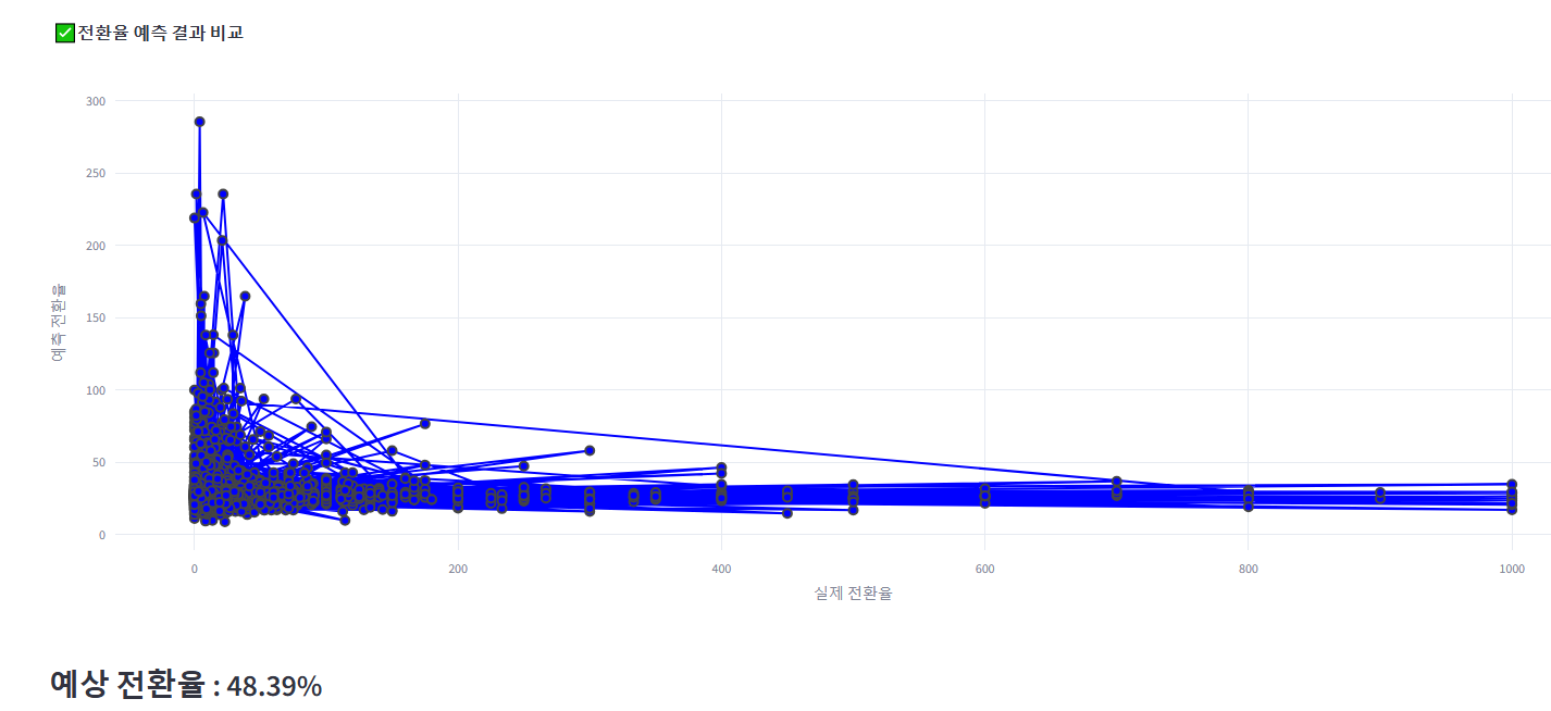
5. 방문자수 예측 그래프
방문자수 예측 그래프 역시 한글 깨짐 + 동적 지원 안 됨으로 plotly 버전으로 바꾸고, 하단에 표시되는 데이터 프레임도 같이 보여질 수 있도록 수정한다.
또한, 방문자수 예측 데이터가 각 월의 첫날의 데이터만 예측하기 때문에, 이를 각 월 집계 데이터로 변경하였다.
with tab5:  #방문자 수 예측
    #데이터 출력
    # 데이터 출력
    with st.expander('오프라인 데이터'):
        st.dataframe(df_off, use_container_width=True)

    city_options = ["전체지역"] + list(city_mapping.values())

    # 학습 데이터 준비
    df_ml_off = df_off.groupby(["날짜", "지역"])["방문자수"].sum().reset_index()
    df_ml_off["날짜"] = pd.to_datetime(df_ml_off["날짜"])
    df_ml_off["year"] = df_ml_off["날짜"].dt.year
    df_ml_off["month"] = df_ml_off["날짜"].dt.month
    df_ml_off["day"] = df_ml_off["날짜"].dt.day
    df_ml_off["day_of_week"] = df_ml_off["날짜"].dt.weekday

    select_region = st.selectbox("지역을 선택하세요.", city_options)

    if select_region == "전체지역":
        df_region = df_ml_off  # 전체 지역 데이터를 사용
    else:
        df_region = df_ml_off[df_ml_off["지역"] == select_region]  # 특정 지역 데이터 사용

    features = ["year", "month", "day", "day_of_week"]
    X = df_region[features]
    y = df_region["방문자수"]

    if st.button("오프라인 방문자 수 예측"):  # 향후 12개월간의 방문자 수 예측
        X_train, X_test, y_train, y_test = train_test_split(X, y, test_size=0.2, random_state=42)
        off_model = RandomForestRegressor(n_estimators=100, random_state=42, n_jobs=-1)
        off_model.fit(X_train, y_train)

        # 최대 날짜의 다음 달부터 12개월 간의 날짜 생성
        max_date = df_region["날짜"].max()
        start_date = (max_date + pd.DateOffset(months=1)).replace(day=1)  # 다음 달의 첫날
        future_dates = pd.date_range(start=start_date, periods=365, freq="D")
        future_df = pd.DataFrame({
            "year": future_dates.year,
            "month": future_dates.month,
            "day": future_dates.day,
            "day_of_week": future_dates.weekday
        })

        # 방문자 수 예측
        future_pred = off_model.predict(future_df)
        future_df["예측 방문자 수"] = future_pred

        # "년-월" 형식의 칼럼 만들기
        future_df["년월"] = future_df["year"].astype(str) + "-" + future_df["month"].astype(str).str.zfill(2)  # 월을 두 자리로 표시

        # 월 별로 집계한 방문자 수
        future_summary = future_df.groupby("년월", as_index=False)["예측 방문자 수"].sum()

        # 예측 방문자 수 형식 변경
        future_summary["예측 방문자 수"] = future_summary["예측 방문자 수"].astype(int).astype(str) + "명"

        st.subheader(f":chart: 향후 12개월 동안 {select_region}의 방문자 수 예측")

        # 방문자 수 예측 시각화
        fig_ml_off = go.Figure()

        # 예측 방문자 수 선 그래프 추가
        fig_ml_off.add_trace(go.Scatter(
            x=future_summary["년월"],
            y=future_summary["예측 방문자 수"].str.extract('(\d+)')[0].astype(int),  # 숫자만 추출하여 y값으로 사용
            mode='markers+lines',  # 마커와 선을 동시에 표시
            marker=dict(symbol='circle', size=8, color='red'),
            line=dict(shape='linear'),
            name='예측 방문자 수'  # 레전드에 표시될 이름
        ))

        # 레이아웃 설정
        fig_ml_off.update_layout(
            title=f"{select_region}의 방문자 수 예측",
            xaxis_title='년-월',
            yaxis_title='방문자 수',
            height=600,
            xaxis=dict(showgrid=False),
            yaxis=dict(showgrid=True),
        )

        # Streamlit에서 시각화와 데이터프레임 표시
        col1, col2 = st.columns(2)

        with col1:
            st.plotly_chart(fig_ml_off)

        with col2:
            st.dataframe(future_summary[["년월", "예측 방문자 수"]], height=550)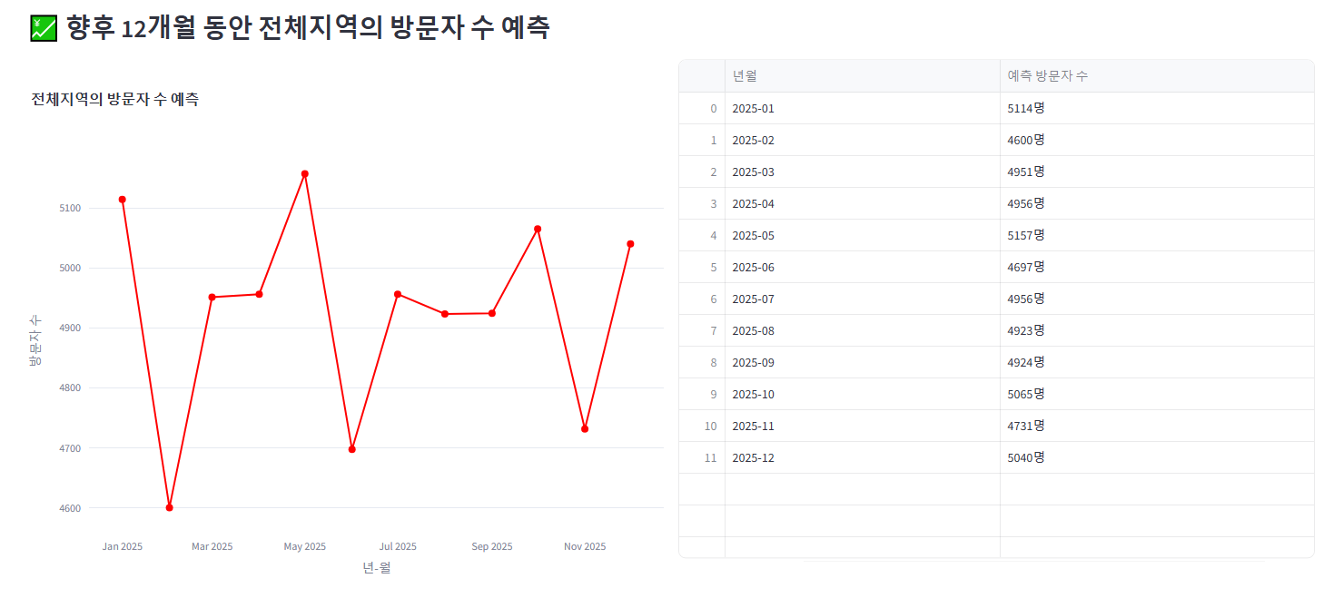
배포 후 팀원들에게 검수 요청을 했다.
최종 버전
재활용 이벤트 성과 지표
This app was built in Streamlit! Check it out and visit https://streamlit.io for more awesome community apps. 🎈
appprjgroup3-dtiyavdpz8ywuhdu6nhint.streamlit.app
▶ 그 후로도 n차 수정을 거듭했다고 한다...
'[파이썬 Projects] > <파이썬 머신러닝>' 카테고리의 다른 글
| [파이썬] 프로젝트 : 웹 페이지 구축 - 11(ML 모델 구현) (0) | 2025.03.25 |
|---|---|
| [파이썬] 프로젝트 : 웹 페이지 구축 - 5 (머신러닝) (0) | 2025.03.20 |
| [머신러닝] UCI Wholesale Dataset: KMeans 군집 분석 (0) | 2025.02.16 |
| [머신러닝]텐서플로 모델 훈련과 배포: 버텍스 AI (실패 및 보류) (0) | 2024.12.07 |
| [머신러닝] 도커(Docker) 설치하기 (1) | 2024.12.07 |


