이전 내용
[Android] 컴파운드 버튼 2 - 라디오 버튼
이전 내용 [Android] 컴파운드 버튼 1 - 체크 박스이전 내용 [Android] 이벤트 리스너 예제이전 내용 [Android] 텍스트뷰 동적 생성이전 내용 [Android] 레이아웃 - 2 : 제약 레이아웃, 레이아웃 편집기이전
puppy-foot-it.tistory.com
토글 버튼
◆ 토글 버튼
사용자가 두 가지 선택 중 하나를 선택할 수 있도록 하는 UI 구성 요소. 일반적으로 상태가 변경될 때마다 시각적인 변화가 제공되므로, 사용자는 현재 상태를 직관적으로 이해할 수 있게 된다. 예를 들어, "켜짐" 또는 "꺼짐" 상태를 시각적으로 표현하는 데 유용하다.
[토글 버튼 사용 예시]
- 설정 변경: Wi-Fi, Bluetooth 등을 켜고 끌 때 사용.
- 앱 기능 활성화: 예를 들어, 알림 설정, 다크 모드 활성화 등의 기능을 변경할 때 토글 버튼 사용.
- 기타 활동: 사용자가 특정 서비스를 구독하거나 해지할 때 활용.
[토글 버튼의 유형]
토글 버튼은 다양한 형태로 제공될 수 있으며, 사용자의 요구에 따라 다르게 디자인될 수 있다.
- 스위치: 좌우로 움직이는 슬라이더 형태로, 직관적으로 상태를 표현. 사용자가 스위치를 오른쪽으로 이동하면 ‘켜짐’, 왼쪽으로 이동하면 ‘꺼짐’으로 전환.
- 체크박스: 두 가지 상태를 가진 버튼으로, 체크 마크가 있는 경우 활성화, 없는 경우 비활성화로 나타난다. 주로 여러 옵션 중에서 선택할 때 사용.
토글 버튼 예제
Q. 전구 두 개를 켜고 끄는 기능 구현하기
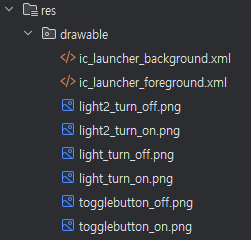
먼저 drawable에 아래의 이미지를 넣어둔다.
<LinearLayout xmlns:android="http://schemas.android.com/apk/res/android"
    xmlns:app="http://schemas.android.com/apk/res-auto"
    xmlns:tools="http://schemas.android.com/tools"
    android:id="@+id/main"
    android:layout_width="match_parent"
    android:layout_height="match_parent"
    tools:context=".MainActivity"
    android:orientation="vertical">

    <LinearLayout
        android:layout_width="match_parent"
        android:layout_height="wrap_content"
        android:gravity="center"
        android:orientation="horizontal" >

        <ToggleButton
            android:id="@+id/toggleButton"
            android:layout_width="wrap_content"
            android:layout_height="wrap_content"
            android:layout_marginLeft="10dp"
            android:background="@drawable/togglebutton_on"
            android:text=""
            android:textOff=""
            android:textOn="" />

        <ToggleButton
            android:id="@+id/toggleButton2"
            android:layout_width="wrap_content"
            android:layout_height="wrap_content"
            android:layout_marginLeft="10dp"
            android:background="@drawable/togglebutton_on"
            android:text=""
            android:textOff=""
            android:textOn="" />
    </LinearLayout>

    <LinearLayout
        android:layout_width="match_parent"
        android:layout_height="wrap_content"
        android:layout_marginTop="20dp"
        android:gravity="center"
        android:orientation="horizontal" >

        <ImageView
            android:id="@+id/imageView"
            android:layout_width="wrap_content"
            android:layout_height="wrap_content"
            android:layout_gravity="top"
            android:background="@drawable/light_turn_off" />

        <ImageView
            android:id="@+id/imageView2"
            android:layout_width="wrap_content"
            android:layout_height="wrap_content"
            android:layout_gravity="top"
            android:background="@drawable/light2_turn_off" />
    </LinearLayout>

</LinearLayout>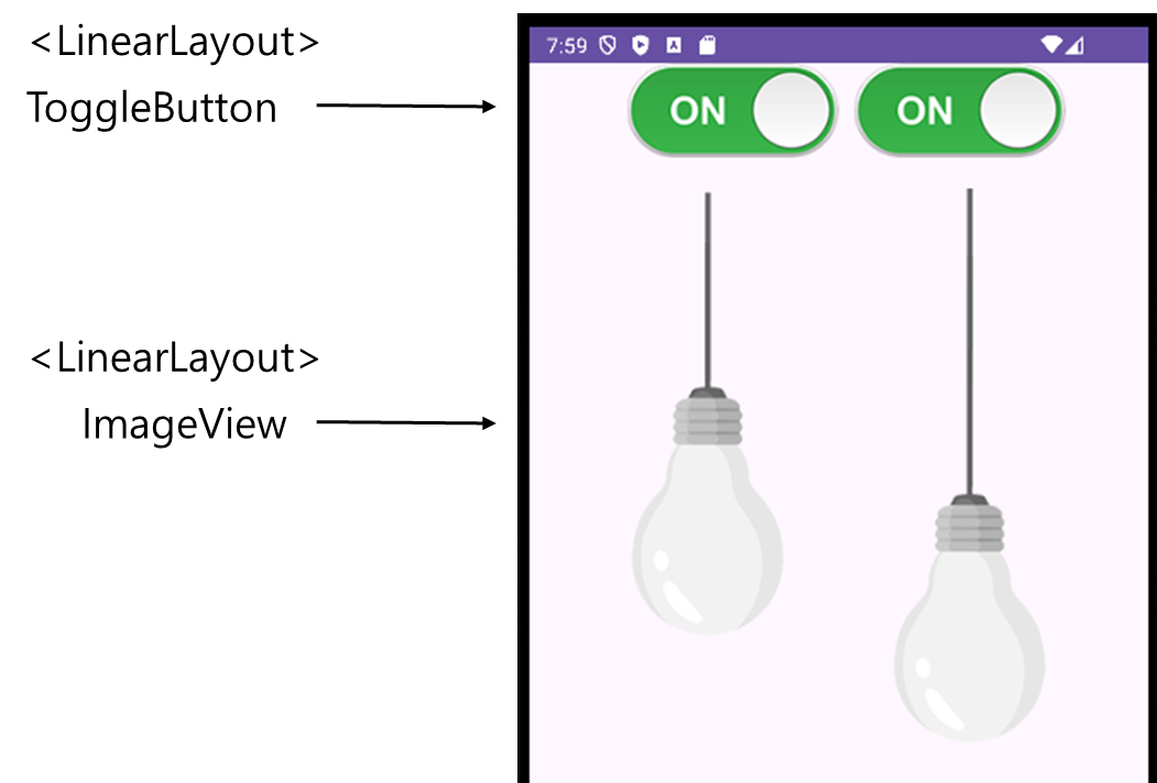
import android.os.Bundle;
import android.widget.CompoundButton;
import android.widget.ImageView;
import android.widget.ToggleButton;

import androidx.appcompat.app.AppCompatActivity;

public class MainActivity extends AppCompatActivity {
    ToggleButton tbObj1;
    ToggleButton tbObj2;
    ImageView ivObj1;
    ImageView ivObj2;

    @Override
    protected void onCreate(Bundle savedInstanceState) {
        super.onCreate(savedInstanceState);
        setContentView(R.layout.activity_main);

        tbObj1 = findViewById(R.id.toggleButton);
        ivObj1 = findViewById(R.id.imageView);
        tbObj2 = findViewById(R.id.toggleButton2);
        ivObj2 = findViewById(R.id.imageView2);

        tbObj1.setOnCheckedChangeListener(new CompoundButton.OnCheckedChangeListener() {
            @Override
            public void onCheckedChanged(CompoundButton compoundButton, boolean isChecked) {
                if (isChecked) {
                    ivObj1.setImageResource(R.drawable.light_turn_on);
                    tbObj1.setBackgroundResource(R.drawable.togglebutton_on);  // On 상태일 때
                } else {
                    ivObj1.setImageResource(R.drawable.light_turn_off);
                    tbObj1.setBackgroundResource(R.drawable.togglebutton_off);  // Off 상태일 때
                }
            }
        });

        tbObj2.setOnCheckedChangeListener(new CompoundButton.OnCheckedChangeListener() {
            @Override
            public void onCheckedChanged(CompoundButton compoundButton, boolean isChecked) {
                if (isChecked) {
                    ivObj2.setImageResource(R.drawable.light_turn_on);
                    tbObj2.setBackgroundResource(R.drawable.togglebutton_on);  // On 상태일 때
                } else {
                    ivObj2.setImageResource(R.drawable.light_turn_off);
                    tbObj2.setBackgroundResource(R.drawable.togglebutton_off);  // Off 상태일 때
                }
            }
        });
    }
}
- isChecked: 토글 버튼이 켜져 있는지( true ) 또는 꺼져 있는지( false )를 확인
- isChecked가 true인 경우, ImageView에 켜진 상태의 이미지를 설정하고 토글 버튼의 배경 변경.
- isChecked가 false인 경우, 꺼진 상태의 이미지를 설정하고 배경 변경
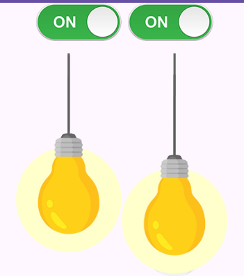
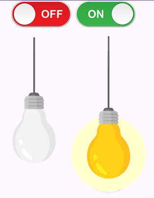
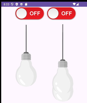
[결과물]
1. 둘 다 켜기
2. 하나만 켜기
3. 둘 다 끄기
다음 내용
[Android] 위젯 - 평점 (RatingBar)
이전 내용 [Android] 컴파운드 버튼 3 - 토글 버튼이전 내용 [Android] 컴파운드 버튼 2 - 라디오 버튼이전 내용 [Android] 컴파운드 버튼 1 - 체크 박스이전 내용 [Android] 이벤트 리스너 예제이전 내용 [Andro
puppy-foot-it.tistory.com
'[Java] > Java Android' 카테고리의 다른 글
| [Android] 인텐트(Intent) - 1: 명시적 인텐트 (0) | 2025.04.30 |
|---|---|
| [Android] 위젯 - 평점 (RatingBar) (1) | 2025.04.30 |
| [Android] 컴파운드 버튼 2 - 라디오 버튼 (0) | 2025.04.30 |
| [Android] 컴파운드 버튼 1 - 체크 박스 (0) | 2025.04.30 |
| [Android] 이벤트 리스너 예제 (0) | 2025.04.29 |


